Design (colour scheme, style and iconography)
Our main text (our music video) works very well with our ancillary texts (the album art and website) as we managed to create a strong brand through the design choices. Using similar design aspects in each text creates synergy, allowing the audience to associate them with one another.
This image shows Janet Devlin's website, debut album cover and shots from her debut music video, all of which have the same 'look', creating visual synergy over the three texts.
Here is a diagram showing the similarities between Ava's album art and website.
Colour Palettes
Looking at these colour palettes, you can see how the album art has a pink colour scheme and the website's colour scheme is more blue with little bits of pink.
Although these colours are quite different, the colour scheme in the music video almost acts as a bridge between them (and therefore the two texts) as it contains equal amounts of blue and pink. The general colour scheme for our main and ancillary texts is therefore blue and pink.
To create more synergy, however, we could have perhaps used more blue on the digipak, as that would have solidified that aspect of the brand a bit more.
 |
| Frame at the Start of the Music Video |
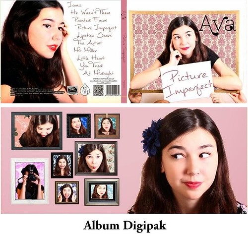
One thing that appears in all of our texts is the frame iconography. A large golden frame features at the start and end of our music video and on our album cover and smaller framed pictures are seen on the inside panel of the digipak and at the top of our website. As well as hinting at the idea of appearance verses reality (a key theme in the music video) repeating the frames on every text allows the frame to become a key prop for Ava.
 |
| Frame at the End of the Music Video |
As well as our use of the frames, we alluded to the idea of appearance verses reality through our choice
of track names and our album name on our digipak.
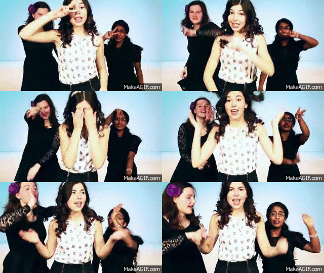
Unlike a lot of artists in the music industry, Ava is very down to earth and a very natural performer. We wanted to highlight this aspect of her identity and therefore another aspect of the video that is repeated in our ancillary texts is Ava's cute expressions. This can particular be seen in the left inside panel of the digipak, the header of the website and when Ava does her routine in the chorus of the music video.
 |
| Website Header |
 |
| Left Inside Panel (Digipak) |
 |
| Ava's Dance Routine |
This Prezi explains the importance of the logo in connecting the main text and ancillary texts. I have used Kate Nash as a case study, drawing direct comparisons between Kate and Ava.
It isn't conventional to include the artist's logo in the music video, and so we decided not to. Placing the 'Ava' logo at the start of the video would have perhaps provided more synergy, however, and as she is a debut artist, including her name might have made it easier for fans or new audiences to identify her.
Conclusion
Overall, we have managed to combine our texts very effectively through our design choices, Ava's repeated image, the repeated 'Ava' logo, and our inclusion of the appearance verses reality theme. The synergy we have created would allow the audience to associate the main text with the ancillary texts and vice versa. To reflect on what we could have improved about our marketing campaign, I think our ancillary texts work better together than they do with the music video. Having said this, the ancillary texts are both static pieces of work (unlike the music video which is a moving image) and so they are bound to have more similarities.


No comments:
Post a Comment