The importance of an integrated campaign cannot be ignored, which is why we decided to make our campaign interactive and cross-platform. This type of campaign is crucial when trying to promote a brand, and it is also important to ensure that the message of the brand is consistent for all three texts. For this question, I reference artists such as Cassadee Pope, Gabrielle Aplin, Katy Perry and fictional pop star, Catherine Bennett. We believe that the combination of our texts was effective in targeting our core and secondary audiences, however we noted that our overall campaign contained more links between the website and music video, as opposed to having consistent links between all three products.
Creating A Synergistic Campaign

|
| A mind map showing the similarities between our three texts compared to two other marketing campaigns by Cassadee Pope and Gabrielle Aplin |
Effectiveness
The only way for us to really be able to judge the effectiveness of the combination of our products was to look at our audience feedback. After interviewing my mum (part of the secondary audience) and my sister (part of the tertiary audience), I combined their thoughts on our synergistic campaign into a Voki. Additionally, below the Voki is a quote taken from my friend, Meg (part of the core audience), who I also questioned. From the feedback I learned that the combination of our album cover and website was the most effective, whereas there
weren't many links between all three texts (apart from the frame).

"I think that the use of the Ava font ties the website and album cover together; it is easily distinguishable as Ava's logo. I also like the repetition of the wallpaper image which a homemade and personal feel to the whole campaign."
Social Media
We wanted to tie our social media accounts in with our music video by having similar colour schemes and styling. We did this by looking at the social media accounts of similar artists, such as Gabrielle Aplin and Laura Marling. Their twitter feeds include their album covers as an integral part of the page, with Gabrielle Aplin using her English Rain cover as her background and header. Similarly, Laura Marling used her album cover for Once I Was An Eagle as her profile picture and header.
 |
| Gabrielle Aplin's twitter feed |
 |
| Laura Marling's twitter feed |
Ava also adopted this convention, as she set her profile picture as her album cover, in order to promote her album.
 |
| Ava's twitter feed |
By tying in the album cover with the social media, we subsequently combined the music video with social media. This created a stronger link between all our products, as the twitter feed included a link to the website and music video, and also signposted the album cover.
Colour Scheme
We knew that the
colour scheme would be integral to the entire marketing campaign, therefore we decided on pastel
colours very early on in the project. This was then developed during the production stage of the project, as we wanted our two main colours for the album cover and music video to be pink and blue; one conventionally feminine colour and one conventionally masculine colour. We wanted to mix these two colours together, as Ava would not stick to the confines of gender roles, and would instead choose to do something a bit different. Below are some colour swatches I made, showing the different range of colours in each product.
 |
| The more prominent colour here is pink |
 |
| The colours of our website are mainly blue and grey - this was quite surprising, as we hadn't consciously decided to have grey in our colour scheme! |
 |
| The music video ties the website and album cover together, as it has an equal mix of both pink and blue |
Similar to She & Him's marketing campaign for "Volume 3", we tried to co-ordinate our colour schemes as much as we could.
 |
| She & Him's album cover - mainly blue and pink |
 |
| She & Him's website colour scheme - mainly yellow, pink and blue - the majority of the website page is the album cover, showing how they tied them in together |
Iconography
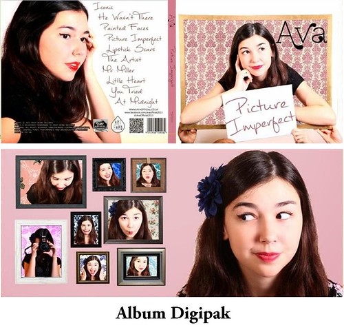
We decided that Ava's iconography for her debut album would be frames, as she has quite a post-modern outlook on life, and likes mixing up reality and fantasy; this can be seen in our front album cover, as the top of her body is in the frame, but we used Adobe Photoshop CS5.1 to edit the image so that the rest of her body doesn't come out of the frame, to explore Stuart Hall's theory of multiple layers of meaning (perhaps she is only Ava when she is in the frame?)
 |
| Using a "colour picker" and "paint brush" tools on Photoshop, I edited the bottom half of Ava's body out of the image |
For the frame iconography, we wanted to draw on Goodwin's theory of voyeurism that "there is frequently reference to the notion of looking and particularly voyeuristic treatment of the female body." Rather than seeing the video through the boyfriend's eyes, the perspective/ point-of-view is Ava's. We decided not to encourage the male gaze and therefore tried to subvert the convention of female sexualisation in pop music. This enabled us to show the audience what Ava wanted them to see, as the video is implied to be a construct of her own imagination. To a certain extent, the video could also provide a narcissistic appeal to young girls, who may see parts of themselves mirrored in her actions and/or personality.
 |
| Originally, we were going to pay homage to this iconic photo of Grace Kelly, however due to the fact that our frame wasn't big enough for Ava to sit in, we decided to only draw inspiration from this photo |
Styling
 |
Some dresses which we thought illustrated
the kind of style we wanted Ava to have |
Because we wanted to do something that wasn't really the norm, we decided to style Ava in quite a retro way; with flowery dresses and a peter-pan collared shirt and skirt. This was mainly because the youth of Britain is constantly bombarded by sexualised images of female artists, wearing skimpy clothing and dancing provocatively. We didn't think this to be an accurate representation of most of the female population, as well as it
being negative in regards to young girls, who would see these images and think that they would also have to look that way to be accepted and liked.
Therefore we styled Ava in a not-too-
conservative but also not
sexualised way. We wanted her to be seen as happy, carefree and comfortable in her skin. This idea of Ava being a role model was raised after we did a class research task on Catherine Bennett, a character created by a young girl, with the sole purpose to be a positive role model for other young girls. We also consistently had Ava wearing red lipstick with winged eyeliner, as we decided to make those things her "trademarks"
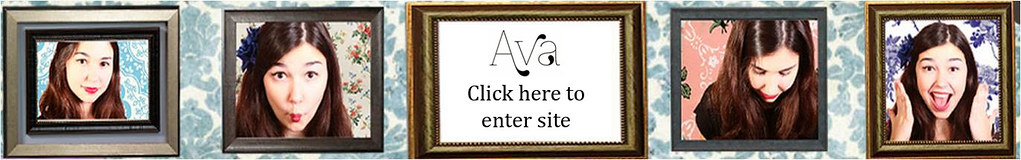
Font & Logo

Choosing a font is always difficult, and we knew that the font we would end up using, would have to be a textual representation of Ava's quirky personality. After visiting dafont.com, we searched for Handwritten or Calligraphic fonts, as we wanted the writing to look like it was Ava's, and therefore create a personal connection between the buyer of the album and our artist. It was difficult to agree on a final font, and we tried out a lot of different styles, but one of the fonts that stuck in our minds was Znikomit No24. We thought that the font was cute and it also had a calligraphic edge to it, which is what we originally wanted. After we showed the
font to the audience, they seemed to really like it, and said that it was "easily distinguishable as Ava's logo".
 |
| Where we found the font; we didn't like the second version, as we felt that it was a bit too thin and wouldn't stand out to our audience |
One of the other things that the audience commented on was the synergistic use of the logo
in the website and album cover, but not in the music video. In hindsight, I think that we should have included the Ava logo at the end of the video to further establish artist identity. Instead of just having a black screen at the end, we could have also had "Ava" appear in white writing, as illustrated in the .gif below. This would have created a stronger link between our three products, and I also think that it looks a bit mysterious, as it would instantly cause the viewer to want to look the name up. It's short and punchy, and it's a shame that we didn't include it in the music video.
 |
| What the end of the music video should have looked like? |
Branding
 |
Ava pulling a funny face,
to show her tertiary
audience that they don't
need to take their clothes
off to have fun/be liked |
As mentioned above, the omission of the Ava logo in our music video was a branding mishap,
however I think that we more than made up for it using the repetition of other images. For example, (as mentioned above) our use of the frame throughout the campaign ensured consistency and
distinguishability, as it immediately created a coherent link between the three texts. We also used lots of shots of the artist herself, as we know how important it is for a debut artist to be recognisable in the industry, and for people to see her the way that she wants to be seen; in Ava's case, we want her to be seen as quirky and optimistic. While some female artists, such as Rihanna and Katy Perry pose very provocatively, we wanted Ava to be seen as cute and funny, through her pulling faces and being quikry and casual.
 |
| Rihanna in a photoshoot |
 |
| Katy Perry in her California Gurls video |
Conclusion
In conclusion, I believe that our campaign to market Ava as a debut artist was successful, as there was synergy between all three products, and Ava's branding remained consistent throughout the entire project. I now know that we should have included the Ava logo at the end of the music video to establish a stronger sense of artist identity, but I am nevertheless pleased with the way in which we marketed our debut artist.


No comments:
Post a Comment