
Example Artist: Laura Marling

How This is Effective:
How This is Effective:
- Helps people to recognize artist - creates unique identity and helps attract new fans
- Monochromatic colour scheme and high key lighting reflects the difficult issues the artist deals with in her music
- Creates a sense of drama that draws viewer/purchaser in
- Stands out attracting people to purchase it
- Links between lead people to investigate different products - may become fans/purchase more
Our use of synergy:
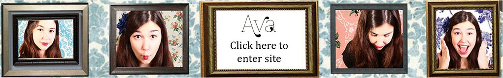
Frames:

 End:
End:
The use of frames is not as pervasive on our website, however as they are used on the banner at the top which appears on every page they are quite effectively integrated. That we used the same frame for the album and the music video was also an effective way of linking them, however we did not use the same frame again on the website. This however is compensated for by the similar feel of the left inside panel and the banner on the website.
Logo:
We didn't use Ava's logo in our main product as we found that indie pop artists used it primarily to link their album, website and merchandize. We copied this, but incorporated our frame iconography into the merchandize logo and the logo on the website to add extra synergy, although the different in boldness of the logo on the album cover may limit its effectiveness. This was because the font we used, Znikomit, was too thin to show up on the busy wallpaper background, which would've made the logo much less effective. We found however, that the font encapsulated Ava's elegance and style as well as transferring into different colours easily.

Colour Scheme:

The blue background of the website and the pink of the flowers, dresses and balloon carried through to our website in particular, but also to some extent our album cover which used a pink colour scheme.

This was perhaps our least effective combination of our music video and website, as the signpost was not that visible in the music video and on the website it looks a little strange because the post is too long, so perhaps we could have cropped the image more so there was less blank space. However, members of our target audience quite liked its quirky feel.


Stagehands:
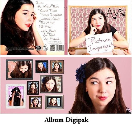
The presence of the 'stagehands' in our video is key to creating a sense of fakeness surrounding the romantic set ups, making them seem more like a pre-rehearsed show rather than a spontaneous show of genuine emotion. We carried this through to our album cover, in which the frames are being held up by two sets of hands. The frame is always held up by anonymous hands except from at the end of our music video, in which Ava is framed in an MS like the MS on our album cover.

Continuous Use of Symbolism:
We used the frame consistently throughout all our products to promote Ava's ideology of being yourself, and being picturesque even if your looks are 'imperfect', appealing to our demographic of young women and girls who would struggle with similar issues.
Synergy across our Album Cover:

- Frames
- Make Up - Red lipstick and eyeliner
- Facial Expressions
- Font - album title and track listing
- Wallpaper
- White and black
- Pink
- Dark clothing
- Floral
However, her hair looks very different on the cover from the inside, and on the back cover Ava's skin tone looks redder than it does in the other pictures, which may decrease the effectiveness of the combination. However, the majority of our cover does work in synergy with itself effectively.
We changed the design of our inside panels in order that they had more synergy:

The first two designs we tried just did not fit with the other inside panel, but using Adobe Photoshop we were able to edit one our pictures that already had a similar facial expression and styling to have the same background. The fact that Ava is looking at all the other frames of her is effective at showing her fun-loving and quirky personality, and references the notion of looking that we explore in our music video.
Synergy in our Website: (Slideshow)
Wallpaper
We used a wallpaper motif in our album and website which had some of Ava's modern retro vibe.

We also used symbiosis in the construction of our website, trying to link Ava with institutions that might attract our target audience of 15-24 year old girls:

 We tried to link all of Ava's different social media sites to one another and to the website, to encourage audiences to explore more of Ava's online presence and hopefully her music, especially as we put particular emphasis on her YouTube page. She tweeted updates about the music video, creating a buzz around it's release:
Guess who's finished shooting her first music video? THIS GIRL #HeWasntThere
— Ava Official (@AvaOfficial2013) November 30, 2013
Everyone get ready for my new single, it will be dropping onto your doorsteps soon!
— Ava Official (@AvaOfficial2013) December 16, 2013
We also repeated some of the photographic, video and news content across the different platforms, tweeting or making a facebook status about updates and developments.
No comments:
Post a Comment