Music Video (left) Album Cover (right)

ALBUM DIGIPAK OFFICIAL YES
Music Video

Website

entersite
Website

Thursday 19 December 2013

Editing

As we were making a on-shot music video we didn't have to do much effort, with much of our effort going into the pre-production of our music video which had to be meticulous.

However, despite getting a large number of great one shots, in non of them did we quite achieve the level of perfection that we were satisfied with. We narrowed it down to 2 shots however:
  1. The only problem was a strand of Ava's hair kept falling in front of her face which we felt detracted from her aura of calm and control, as well as from her appearance and the audience's ability to fully connect with her as they may have been distracted
  2. During the final set up the shark hit Ava which made her lose character for a second
Luckily, because we found using the tablecloth cut to be ineffective as it was always at different distances from the camera we had decided to cut it out of the choreography. This meant that we could cut out a complete tablecloth take from a previous one shot from the second shoot using Adobe After Effects, so we were able to use it as a transition between the two takes, using the first 2 set ups from take 2 and the 3rd set up from take 1.

Monday 16 December 2013

Making Merchandise

We made lots of merchandise in order to increase the purchasing opportunities on our website and the audience interactivity, and so that fans can identity themselves with our Artist. This was particularly important as out target audience of 15-24 year olds and our secondary audience of 8-15 year old girls often enjoy buying merchandize, and their parents will often buy merchandize as a gift for their children. We also catered for our target audience's typical interests of baking and fashion.


Development of the Homepage

 
Initially our homepage only displayed the slideshow of events and news items, but we realised that it was not particularly interactive or immersive - which is essential for a website homepage. One thing we therefore decided to add was the Twitter feed, which allows fans to see what Ava is talking about as soon as she says it. This will make the fans feel like they have a stronger relationship with her. We also added a banner for her new single 'He Wasn't there', and a link to her debut album, 'Picture Imperfect'. The countdown to her UK tour was a late addition, but it creates a more exciting atmosphere, and a link is also provided to buy tickets for the tour.
 

Clicking on the 'Buy Tickets Now' button will take the user to the Tour page. Initially this page was named events, but upon conducting further research, we realised that it was more conventional to have a Tour page rather than an events page, especially as many of the 'events' can come under the news section.

Ava's Involvement With Charities

 
Since the beginning of the project, we decided that Ava would be strong supporter of equality, therefore it made sense to recreate one of the iconic NOH8 promo photos.
 
MISSION STATEMENT: The NOH8 Campaign is a charitable organization whose mission is to promote marriage, gender and human equality through education, advocacy, social media, and visual protest.
 
Another promo shot of Ava being involved with charities is the Childline poster we made, to show how she is involved in helping out children that are struggling or being bullied, and to use her celebrity status to raise awareness.


Friday 13 December 2013

Developing Ava's logo

We tried out several different fonts before settling on Znikomit because we liked the way the curves on the font intersected with each other in an elegant way:


Tuesday 10 December 2013

Possible Album Names

  • In The Afternoon
  • Postcards and Petticoats
  • Petticoats and Polaroids
  • Take 1
  • Ava in the middle
  • Comic Sans
  • Stepping Out
  • Clean Slate
  • Pictue Imperfect
  • You've Been Framed

Development of the news page


The news page of Ava's website, initially, followed conventions of websites I'd analysed in the past, such as that of Kate Nash and A Fine Frenzy, in that as well as notable events that the artist had attended, the news page had articles featuring other brands and companies that the artist had collaborated with. So, as well as talking about the upcoming release of the music video and providing an exclusive sneak peek of the album cover shoot, I also added articles about working alongside organisations such as The National Trust and UK Feminista.  
 

Above is the initial version of the news page that I created. I used a pastel colour scheme and a pin board theme that is being used throughout the website. However, the website appears to be too text-heavy, and as this is supposed to be a visual form of marketing, we should try to cut down the text and put a larger focus on the images.

Below is a screenshot of the news page after a very rough edit, during which I cut down the words, made the font bigger on the articles and enlarged the images, in order to make the news page but informative and aesthetically pleasing.


Website To-Do List

- We need to make the homepage more aesthetically pleasing - one idea could be to put up stills of Ava with separate bits of information, such as tour dates, album releases and brand endorsements.
- Our news page, at the moment, is fairly text heavy and since a website is supposed to be a visual form of marketing, it is essential that we cut this down.
- Our music page needs work as we must add a track list from Ava's debut album, alongside a Soundcloud clip of He Wasn't There
- Our photo galleries must be changed so that the galleries for the album shoot and for the music video shoot appear on different pages.
- Although we have a few products on the shop, it would be great to personalise a few more and make them available on the online shop.
- The link to Ava's Tumblr account/ visual blog does not seem to be working so we must find a solution to that.

Album Art Development

Album Cover
We finally decided on the photo we want to use for our album cover, and with this photo, we can still incorporate our original frame idea into the digipack. When editing the original photo we decided to remove Ava's body from outside the frame to make it look like she is only in the frame. We also added the pink wallpaper background in the frame to give it more of a girly feel. Initially we considered removing the hands, but we then thought that the stage hands idea is very prevalent in our music video, and so featuring them on the album cover would provide synergy between them. 
 

When trying to scale this image on the digipack template, we had to resolve some issues. One issue was that we were trying to fit a rectangle frame in a square template. This took a while to resolve, but we ended up cutting out parts of the frame and moving them inwards so that they would not be cut off when printed.


Left Inside Panel
For the inside left panel, we continued to use the wallpaper and frame idea that is on the front cover. The wallpapers in the frames have a pastel colour scheme.
 

We decided to change the background of the wall to fit in with the colour scheme of the front cover, and we edited some of the wallpapers in the frames as we felt the green and purple was too great a departure from our established colour scheme.
 
Right Inside Panel
We considered using a picture of a record player behind the CD, especially as it fit in with her retro modern feel.


 We then decided to create more synergy between the two different inside panels, first by trying out some of the pictures we took with the frames:

Then by trying a picture with the same colour background.

Back Cover
We used a simple but iconic picture of Ava for our back cover, putting our track listing in line with the contours of her profile.


Grading

Anna used this video as it taught her how to create a mask using Secondary Color Corrector, allowing Anna to change Ava's orangey skin tone by creating a colour mask. Anna did this by changing the settings of the video to composite then using the pen tool to piock the colours she wanted to change.
http://tv.adobe.com/watch/short-and-suite/basic-secondary-color-correctiongrading-in-premiere-pro-cs55/


Anna tried several test grades to make Ava's skin tone match what it's like on the Album and the website.

We then used the colour finesse tool in Adobe After Effects to achieve a better overall tone, then once again the Secondary colour tool to edit the pinks which had looked quite dull.

Wednesday 4 December 2013

Brainstorming Song Names

Here is a list of song names we brainstormed for Ava's debut album:
  • Wild Youth
  • Porcelain
  • Jitter-Bug
  • Bag of Tricks
  • He Wasn't There
  • James Dean
  • Apple Crumble
  • Turn Right
  • At Midnight
  • Trepidation
  • Bournemouth Blues
  • Leeds Lies
  • Southend Salutations
  • Warwick Ways
  • Dundee Dancing
  • Seaside Romancing
  • You Tried
  • Broken Bones
  • Tiny Toes
  • Grimsby Goodbye
  • Hugs from Hull
  • Dreaming in Ink
  • Lifted
  • Jukebox
  • Tequila Mockingbird
  • Head in the Clouds
  • In the moonlight
  • Getting Over You
  • Brainflower
  • Polka Dot Pinstripes
  • Iconic
  • I don't have to love you
  • Lipstick Scars
  • Shipwreck
  • Little Heart
  • Tick Tock
  • The Author
  • Silver Lining

Tuesday 3 December 2013

Flat Plans

Website

 
We designed a flat plan for our website before making it on Wix, in order to have a basic idea of what we were trying to accomplish:
  • Home page; will be simple yet striking, with Ava's debut music video, He Wasn't There playing automatically. We will also have the official "Ava" logo which will be used over all the products, such as the album cover and merchandise
  • News page; will have various posts describing Ava's recent activities
  • Music page; will have Ava's album front cover, with a link to the music video and various samples of songs from her album
  • Events page; will have an embedded calendar that has been linked to Ava's Google account, which will show all her upcoming events, such as concerts, meetups etc
  • Lyrics page; will have handwritten lyrics to all of Ava's songs, and will also include purchasing opportunities to buy the piano/guitar chords to her songs
  • Gallery page; will have behind-the-scenes photo slideshows of Ava's music video and album cover shoots, with a narrative description of what happened on each day
  • Shop page; here the fans will have the opportunity to buy personalised merchandise with Ava's iconography, and they will also be able to buy limited edition bundles, including T-Shirts, signed albums and mugs etc
  • Blog page; we found a widget that enabled us to directly embed Ava's BlogSpot blog into the website, so it will create a coherent link between Ava's personal life and the access her fans have to her life
  • Colour scheme; we decided on pastel colours, as they connote naturalness and youth, which are some of Ava's most appealing characteristics

Synergistic Marketing Campaigns

Hard Out Here campaign (Lily Allen)
 
The mustard yellow colour scheme is very prominent throughout the campaign, featuring as the background of the images on the album cover and website, as well as the colour of the set in the actual music video. Furthermore, Lily's outfit is the same in the still photography as it is in the music video, which, as it is already quite unique, makes it instantly recognisable. However, we would preferably like to use different images on the album cover and website, unlike this particular campaign. The photos would be similar in colour and style, but serve different purposes. As we can see on the screenshot of the website homepage, there is an immediate purchasing opportunity available, whereby the visitor can buy the Hard Out Here single.


In Your Hands campaign (Eliza Doolittle)
- Eliza Doolittle's website simultaneously promotes both the album (In Your Hands) and one of the principal singles (Let It Rain), primarily through the imagery used. Once again, the image used on the album art becomes the focal point of the website, accentuated further through the use of purchasing opportunities (buying the album) and the chance to interact with others who are talking about the single/ album through Twitter and other social networks.
Upon entering the site, the focus is moved to the latest single - a still photo taken during the Let It Rain music video shoot becomes the background, as well as many promotional photographs of Eliza herself.


How we will create a synergistic marketing campaign
- We should strongly consider using the same, or similar, imagery as is used in other elements of the campaign. The imagery should be accompanied by links to social media and purchasing opportunities on the website in particular, in order to heighten the user experience.
- The logo, or the font used, should be consistent throughout the music video, the album cover and the website.
- The colour scheme chosen should be fairly unique in the sense that it can be instantly recognised by association with other parts of the campaign
- The props and costumes that appear in the music video could become a very strong part of the album art and website and that they become instantly recognisable and the consumer is able to establish a link between different parts of the campaign.  

Album Art and Website To-Do Lists

Since we have very little editing to do on our music video, we are now concentrating largely on album art and the production of the website. We have started making plans and mock-ups of both aspects of the campaign, and here are some more specific things that need to be done in order to achieve an album cover and website that will integrate seamlessly into the marketing campaign.

Album Art
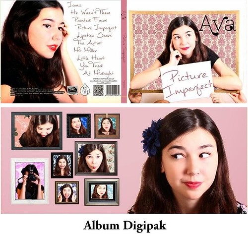
- Unfortunately, our idea of using the Grace Kelly popular culture reference did not work too well on our shoots, but luckily we took various other photographs with varied costumes, props and shot types to use on an alternative cover. Therefore, we have to create another flat plan and mock up of our album art.
- We also have to make sure that all the conventions of album covers are on this flat plan, including copyright and institutional logos, which in our case, would be the Fruit Bowl Records logo.
- We must come up with an album name that would be suitable for a debut album, as well as various song names for the back cover.
- Initially our frame idea was to act as an illusion in the sense that the front cover would be her sitting on the frame looking at the camera, and the inside cover would be the back of that image. We would still like to do something clever with our album art, and so when we plan our alternative cover, we should take into account what can be done.
- The colour schemes and fonts need to be finalised- we know roughly that we are using light colours and a really simplistic font.

Website
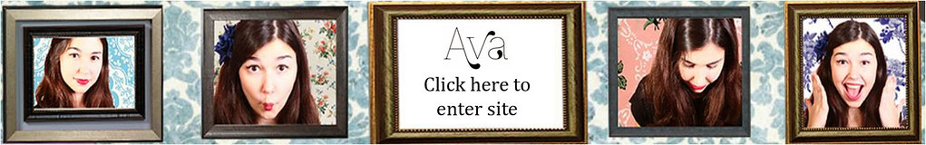
- We must create flat plans for each page of the website, along with a checklist of things that must go on each page, such as access to all the other pages, a header (with a link to the homepage), social media links, and a consistent background/ colour scheme.
- One idea we had for our header was to use Polaroid picture frames lined up next to each other with various shots of Ava in each one, the middle one being the brand logo. One thing we must consider with this idea is if it would then be synergistic with our album cover, in which we are planning to use small frames.
- A convention that we found amongst the artist websites was the presence of a blog, which added a personal touch to the website. We have created blogs on both Blogger and Tumblr for Ava, so linking them directly to the website could be considered.
- Merchandising may also be something to consider- even though Ava may be part of an independent music scene, merchandising would provide yet another source of revenue in a competitive industry. For example, A Fine Frenzy sells an illustrated eBook along with her album, which corresponds to the interests of her target audience. Using this case study, we must consider the wider interests of Ava's target market, and cater to them by offering them products which correspond to these interests, such as short books/ stories, short films to download or quirky little accessories.

Developing Images

Following on from the them of frames in our music video and our album cover, we decided to develop imagery using frames, connoting her picturesque quality, her hidden side and that people try to silence/still her but she can't be tamed.

This is a possible design for the back of our digipack.
 
This could be a possible banner on our website:

 
This might work for a background of the website if we don't use our album cover:
 
I also tried a Romeo and Juliet style image to show that she doesn't need a man  and her independence.
 
We also experimented with a pop art look.


I put many of the photos from our first shoot in frames:


I tried out putting our Grace Kelly posed pictures in a different frame to see whether the thumb poking out would work.


Emily also experimented with black and white effects to achieve a retro starlet look:


I also experimented with other black and white effects, testing out pop art effects as well.


Monday 2 December 2013

Back Up Shoot - 30/11/13

We had our final shoot last Saturday, which we felt was necessary to secure the perfect one shot. Overall, the shoot went really smoothly, and we are really happy with the many takes that we managed to shoot throughout the day.
 
As the studio was free the day before, we made sure we sorted the lighting out prior to the shoot day, as well as any props that needed to be finalised. This saved time on Saturday morning to communicate with our stagehands and solve any last minute difficulties.
 
Another thing we made sure we did prior to the shoot was to mark up the position of the props, so that each take could be as close to perfect as possible, with the props aligned as they needed to be. This not only helped the stagehands with their job, but also made the process of resetting the set a lot quicker and easier.
 
As this was our last shoot, we wanted to do complete one-shots throughout the day rather than rehearse beforehand. Therefore, we called in stagehands who had been to one or both of the previous shoots, so that they knew roughly what their individual roles were.
 
We also had to make sure we kept everybody's morale up, as with the lights and consistent movement of stagehands, the studio did get quite warm and the crew did get a little tired towards the end of the shoot. We tried our best to keep everybody happy by encouraging them to have fun, and also providing them with food and water.