
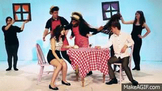
Our music video is a one-shot music video for debut British Indie artist, Ava. As well as being a one-shot, the video involves constructed set, which our set hands move around to create typical romantic settings. We followed some conventions of Indie-pop artists' music videos, but followed more conventions of one-shot music videos as that was our main element. I will be mainly referencing Indie-pop artists Lily Allen and Kate Nash, and one-shot music videos like McFly's 'Love is Easy'. The video below shows how our video compares to other one-shots, Indie-pop music videos and videos with constructed sets.
Our comparison video highlights the conventions of Indie, one-shot, and constructed set music videos, many of which we followed in 'He Wasn't There':

Analysing our music video according to Goodwin's theory
Our music video uses some aspects of Goodwin's music video theory, but also challenges other aspects in certain ways. Goodwin believes that there is a relationship between lyrics and visuals and between music and visuals, whether that be illustrative, amplifying or contradicting them. Our whole music video is a satirical stance on the lyrics, as although the lyrics suggest that the girl should forgive the boy despite not being there, Ava is having none of his attempts at getting back with her. Some of the visuals in our music video therefore provide disjuncture. On the other hand, as our music video is supposed to have a certain comic value, some lyrics have been illustrated literally through the use of props and actions. We have therefore followed the convention of having a relationship between the lyrics and visuals, even though at some points it is contradictory.
ILLUSTRATION:
"It didn't matter if he let me down, "And everyone said, you have
I didn't care about the lies." to give him some time..."
"...your ex wife....no need, no "taught me right from wrong...
need to apologise" you didn't keep in touch..."

"love me very much... "...give him some time...I'm
I'll always be your little girl" glad that I gave it to him..."


On further research, we realised that although music videos for Indie-pop artists do include close-ups, they are used more to show the artists' personality rather than their 'beauty'.

In these shots, for example, we can see both Kate Nash's and Lily Allen's sarcastic nature, and Eliza Doolittle's fun, care-free attitude.

 As our music video is a one-shot, we initially didn't really think about this aspect, but realised that the lack of beauty shots meant that it was harder for the audience to identify with Ava, and her personality didn't really come across as she was so far from the camera.
After our first shoot, we therefore changed the choreography and decided to have Ava coming a lot closer to the camera in the choruses, creating a MLS rather than a VLS.
In the third shoot, we made her come even closer for a MS. This is a slight challenge to the convention as beauty shots are often close-ups, but again, the fact that our video is a one-shot meant that it was too difficult to go from a VLS to a CU without moving the camera and affecting the timing.
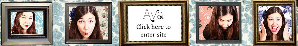
Another demand would be a visual style that occurs over all the artist's work. Very early on in the project, we decided that we wanted Ava to have a slight retro style, partly because our song ('He Wasn't There') has a very old-time feel. Here is a moodboard showing the look we were aiming for - a collection of images from popular culture, including films, other artists, and iconic images.

The diagram below shows how we incorporated some of the influences on our moodboard into Ava's look. These images come from our three different texts, showing how we followed the convention of having a visual style that occurs on all of the artists' texts.

Goodwin noted how a conventional feature of music videos is frequent reference to the notion of looking. We followed this convention with our frame iconography as it is a literal symbol of this 'notion of looking', and we repeated it on all of the texts to provide synergy.

Another aspect of this 'notion of looking' is the sexualisation of the female body. This is a convention we really wanted to challenge; the video below explains how we challenged it and why we wanted to.
We also decided to invent an all female record label, Fruit Bowl Records, with only female artists, female staff and female gatekeepers. We didn't like that the music industry is largely dominated by men, what with the notion of the male gaze.

Website
This video explains some of the website conventions we followed through comparing Ava's website to Gabrielle Aplin's and Ingrid Michaelson's websites. Aplin and Michaelson are both Indie-pop artists, and so we were focusing more on conventions of websites for artists of this genre rather than general website conventions.
Design Conventions for Websites for Indie Artists

- The blog style of the sites - more current, Tumblr-style (which is becoming increasingly popular, especially with Ava's target audience, 16 to 24 year old girls)
- The header with the artist name and iconography/a slogan that establishes the artist's' identity
- The use of playful but clear fonts which are used throughout the site for synergy
- A beauty shot of the artist near the top of the page
- A simplistic, cute design - patterns, hearts, pastel colours
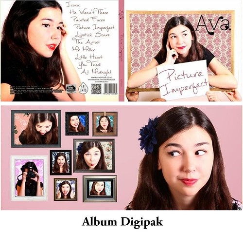
Album Art
In most cases the album cover also features a shot of the artist, although sometimes there are abstract interpretations of an artist or some kind of art that represents the album and/or artist. We realised that album covers for Indie female artists, however, are often quite simple, with a shot of the artist and perhaps some iconography that reflects the theme of the album.

The Development of the Album Art
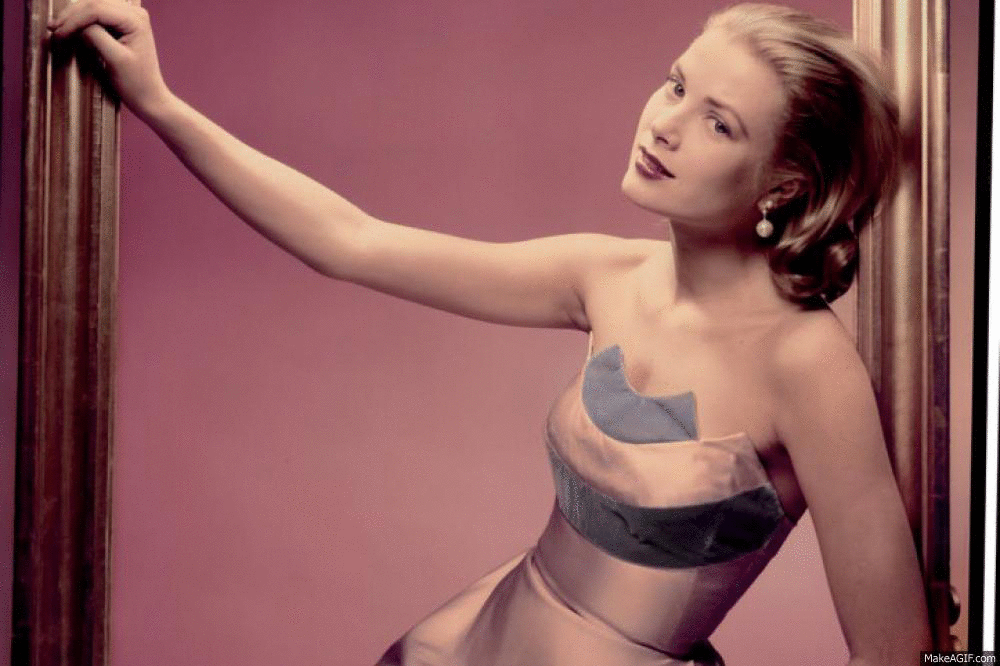
Our original plan for our album cover was a popular culture reference to the iconic Grace Kelly photograph of her sitting in a frame. This is when the frame idea first came about, and it soon became key iconography in Ava's texts. We initially wanted to replicate the Grace Kelly photograph but it did not translate very well to the small, square-shaped album cover. We therefore played around with the frame a little, and the result can be seen on our final album cover. As well as on the cover, we wanted the frames to appear throughout the digipak, and so we considered how we would integrate the frames into the other panels. Eventually we decided to have frames on two of the panels, and the other two without frames - just so there was more variation over the digipak and so that it wasn't dull.
The gif below includes screenshots of our Photoshop template during the construction of our digipak, showing the development of our album art. One of the inside panels proved quite difficult for us; we wanted a simple image for the panel (as this was the panel that would be covered by the CD) but we didn't want a dull, uninspiring image. Eventually we decided on a photo where Ava is pulling a funny face, highlighting further how she is very down-to-earth. In hindsight, we probably should have included more long shots as many of the photos on the album art are close-ups. Including long shots or even more mid shots would have allowed the audience to get a feel for Ava's retro style, which was quite key to our project.

No comments:
Post a Comment