

Having conducted research into indie pop artists and their brand identities, as well as the stylistic technique of a constructed set and the format of one-shot music videos, we established lists of conventions that we either chose to use, develop or challenge. We recognised these conventions by analysing real media products such as Lily Allen's The Fear, Regina Spektor's How and Lenka's website (lenkamusic.com), that which helped us to construct our own music video, album cover and website. In my opinion, as well as following certain conventions, we subverted some, particularly of representation, in order to convey our dominant message of women being strong and autonomous.
Style of Music Video
It was very early on in the
project, upon hearing the slightly vintage feel of Lily Allen's track, He Wasn’t There, that we decided to
create an artist with a distinctively retro style. Not only does this style
correspond with current trends of what our target audience is interested in,
but we also feel that this retro style strongly supports Ava’s brand as one
that challenges the convention of the sexualisation of women in contemporary
music videos.

As you can see above, we drew
visual inspiration from iconic photographs of actresses such as Audrey Hepburn
and Marilyn Monroe, both of whom had extremely individualistic styles, which
was something that we really wanted to instil in the character of Ava.


 From left to right: image used on the album cover, stylised image for the website, a photo from the music video shoot.
As you can see above, we took aspects of our style moodboard and embedded them into each media product, such as printed, feminine dresses, playful headpieces and makeup techniques such as winged eyeliner and vibrant lip colours.
As you can see above, we took aspects of our style moodboard and embedded them into each media product, such as printed, feminine dresses, playful headpieces and makeup techniques such as winged eyeliner and vibrant lip colours.
Consumption Habits
One of the purposes of a music
video is to be visually immersive to the viewer, who would then be persuaded to
purchase the single. Thus, music videos are constructed and designed to be
watched repeatedly. As ours was a one-shot, we could build on this purpose of
music videos, as viewers are able to immerse themselves into the
video by following each of the characters through the narrative. We found, through our research, that artists such as Cocknbullkid and Taylor Swift had also used characterisation as a means of encouraging viewers to rewatch their one-shot music videos.
 |
| Cocknbullkid's video for Yellow features various set hands playing the roles of dancers, builders, and French men |
 |
| In Taylor Swift's one shot video for We Are Never Ever Getting Back Together, the audience simultaneously sees Taylor and her boyfriend, who is cheating on her at the time |
 |
One particular example is demonstrated through this screenshot, where a lot of things seem to be happening - in the foreground, Ava is on her dinner date with her boyfriend, whilst in the background, the viewer sees some comical conflict between the serenaders and the character of the ex-wife.
|
Music Video Narrative
Conventionally, music videos are
edited between performance sequences and narrative sequences, in order to
create a division between the character that the artist is playing and the
artist themselves. However, we also found, through our research, that in the
indie pop genre, artists tend to perform throughout the music video, even
during the narrative sections.
Top left: Regina Spektor in Samson; Top right: Florence Welch in Shake It Out; Bottom left: Kate Nash in Mouthwash; Bottom right: Lily Allen in The Fear
This is how I would categorise
the narrative/ performance balance in He
Wasn’t There:

 |
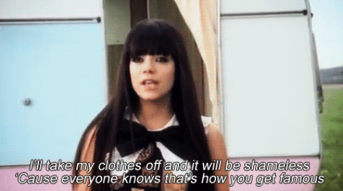
| "I didn't care about the lies": An example of Ava performing whilst being within the narrative, which I think heightens the notion of 'exposing' the true colours of her boyfriend |
Andrew Goodwin’s Music Video
Theory (Dancing in the Distraction
Factory, 1992)
We analysed our video using
Goodwin’s theory of music video features, such as the use, development and challenging
of genre characteristics, record label demands, intertextual referencing and
the relationships between visuals, music and lyrics. Please double click on particular parts of each slide to zoom in to text, photographs and videos.
For example, as can be seen on the first slide of the presentation, we established conventions for not only the indie pop genre, but also videos that incorporated a constructed set and utilised the one shot structure:
- Extensive use of props and costumes as semiotic devices
- Colourful, bright, almost childlike sets to connote happiness
- Usually an upbeat song and video that may have a satirical stance or a message to convey
- Performance and narrative are usually interlaced, as the narrative is often very strong for videos in the indie pop genre
As He Wasn't There is a one-shot music video, very little of Vernallis' theory applies to it. However, one thing that Vernallis states in her theory on music video editing is that the cuts are usually 'foregrounded'.

One part of our music video that was edited was the section in between the second chorus and the final boat scene, which is separated by the red and white tablecloth flying across the screen. This was added in Adobe After Effects to continue the illusion of the video being a one-shot, and thus became 'background editing', which corresponds to David A. Cook's theories about classical Hollywood cinema and realist narratives (A History of Narrative Film, 1985).
The fact that our editing is closer to film editing and music video editing accentuates the notion of the music video being a parody of stereotypical romantic films, as we echo their editing style too.
Album Cover
The album cover has the primary functions of:
- Acting as a form of visual advertising, whereby the consumer is given the power to choose whether or not they are attracted to the album
- Providing a flavour of the music or the genre
- Being memorable, original and thus valued by the consumer
- Providing information about the music and its production


 |
Above are some debut album covers of female artists in the indie-pop genre. Although the album art varies, the covers are generally quite conceptual, but what is important across all of these covers is the artist's name. The name/ logo is the most prominent part of the cover, because as a debut artist in the music industry, it is perhaps more important to establish an easily recognisable name rather than a concrete visual style.
Below is an annotated version of our digipak, which demonstrates both how we used the conventions of album art, and certain aspects we could have improved on.

Website
The website, in a marketing
campaign, serves as the hub, whereby not only is the artist promoted, but also the
institutions that are associated with the artist, including the record label
and any brands that the artist has collaborated with.
The presentation below is a comparison displaying
how we researched and implemented website conventions, using Lenka’s website as a reference
point, and how we decided to either incorporate or challenge them.
Using, developing and challenging conventions of websites from SharleneGandhi1
Prior to creating Ava's website, we also discovered that the three most important things for a music artist's website to have were interactive opportunities, purchasing opportunities and a consistent sense of branding. I analysed A Fine Frenzy's website according to these three criteria, and then, going back to Ava's website further explored the opportunities we had for our audience members.
A potential criticism of our website could be that we did not promote our record label, Fruit Bowl Records, enough, nor did we promote a specific ticket-selling company for Ava's tour. However, on our news page, we did incorporate some brands that we think would collaborate with Ava; we established a symbiotic relationship with these brands by providing them with an alternative marketing platform.


Prior to creating Ava's website, we also discovered that the three most important things for a music artist's website to have were interactive opportunities, purchasing opportunities and a consistent sense of branding. I analysed A Fine Frenzy's website according to these three criteria, and then, going back to Ava's website further explored the opportunities we had for our audience members.
 |
 |
|
A potential criticism of our website could be that we did not promote our record label, Fruit Bowl Records, enough, nor did we promote a specific ticket-selling company for Ava's tour. However, on our news page, we did incorporate some brands that we think would collaborate with Ava; we established a symbiotic relationship with these brands by providing them with an alternative marketing platform.
To summarise, we used, developed and challenged conventions of indie-pop music videos, album covers and websites in a way that suited our core target audience, and also with our brand image in mind. Although we used and developed conventions of one-shot music videos, we challenged those regarding the representation of women in the music industry, and, more precisely, we also challenged the under-representation of ethnic minorities in the indie-pop genre.
No comments:
Post a Comment