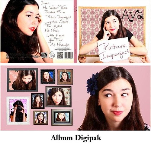
Front Sleeve:
- On the front sleeve, we will have Ava leaning on a large frame - drawing on the iconic Grace Kelly photo (a popular culture reference).
- We will have the album name in a speech bubble (also key iconography in our video), drawing on Roy Lichtenstein's 50s pop-art.
- Her name, 'Ava', will be in a decorative typeface.
- Drawing on appearance vs. reality, on this sleeve we intend to see the image on the front sleeve but from the back.
- The message in the speech bubble on the back will contradict the album name in the speech bubble at the front.
- Through the frame, we will see what Ava sees.
 Middle Right Sleeve:
- On this sleeve, we will have Ava looking out of a variety of frames, probably circular shaped (similar to submarine or rocket windows).
- She will be pulling a different expression in each frame to highlight the different sides to her character.
- As with all albums, we will have the track-list on the back, written in the same font as the album name to provide synergy, and promote the brand.
- We will also have some more frame photos (like on the middle right sleeve)


No comments:
Post a Comment