Music Video (left) Album Cover (right)

ALBUM DIGIPAK OFFICIAL YES
Music Video

Website

entersite
Website
Showing posts with label Mila's Evaluation. Show all posts

Saturday, 11 January 2014

1) In what ways does your media product use, develop or challenge forms and conventions of real media products?

For this project we created Ava, a British, indie-pop artist, who was heavily influenced by artists such as Lily Allen and Kate Nash. We produced a music video for her debut single, He Wasn't There.

Our media products use a lot of the typical conventions of music videos, album covers and websites, but we mainly decided to challenge the feminist theory of "the male gaze", and therefore decided to not sexualise our main artist; we wanted the audience to watch the music video from her point of view, and to therefore connect to her character on a more personal level. Below is a video we edited, which details the references used throughout our whole He Wasn't There project, which helped us to identify the genre conventions of indie-pop music videos, and some of the music video techniques used for the one shot format. Researching these videos also taught us how to establish artist identity, especially for debut artists.


MUSIC VIDEO

Representation


Above is a video explaining how we used representation in our music video, and the ways in which we wanted to develop the representation of race and gender in pop videos

Suggestive sexualisation used in Katy Perry's Roar

The controversial Wrecking Ball, showing nudity and extreme explicit sexualisation

Typically in mainstream pop, female artists, such as Rihanna, Katy Perry, Miley Cyrus and Beyonce, are sexualised due to the heirarchic nature of the music industry; the industry is run by men or "gatekeepers" and these men are considered to be the most important audience when it comes to music videos. This shows how the industry is steered by the "male gaze", which leads to the treatment of women as sexual objects, due to the fact that men are almost always behind the camera. We decided to challenge this convention, as Ava would be a feminist and therefore wouldn't put up with being treated as an object.

Furthermore, we styled Ava in a very feminine way, putting her in floral dresses and skirts, so as to show that she can be both assertive (when she rejects the boy's advances) and also feminine and sweet (when she dances with her friends). We also decided to develop the "girly" stereotype, by also presenting Ava as a strong, positive and non-passive character.
A moodboard we created right at the beginning of the project, to show the retro style that we wanted to emulate throughout the project

Ava's Industry Background

It was very important for us to try and challenge the music industry's lack of female leadership, therefore we decided to create a record label (Fruit Bowl Records) that is mainly run by women. This was after some research into female leadership in the music industry, which raised some shocking statistics.

Survey done by Creative & Cultural Skills
Statistics from PRS for Music's data collection
Further research led me to AIM's 2012 membership survey, which revealed that only 15% of labels are owned by women.

These shockingly unbalanced statistics were one of the main reasons that we decided to challenge the typical convention of women being signed to male-fronted labels, as I believe that the "gatekeepers" scenario, of only men running all aspects of the industry's decisions, is outdated and inaccurate.

Editing

Despite having done research on Carol Vernallis' theory of editing, we knew that our music video format of a one-shot wouldn't require any editing, as it is quite a unique style of music video. Her theory states that music video must include non-linear montage scenes, however as our video is a one-shot we will be completely defying this convention. We think this could be a good USP for our video, as it would make it unique and quirky.

After doing research on Andrew Goodwin's theory, we decided that we wanted to draw on his theory of the relationship between the visuals, music and lyrics as being either amplifying, disjunctive or illustrative.


The above powerpoint demonstrates some of the ways which we planned to tie the visuals in with the lyrics.

Illustration

vavavav
"I didn't care about the lies"
vavavavkj
"If you'd have stayed with your ex-wife"
vavavavkj
"I wouldn't change you for the world"

Disjuncture

vavavavkj
"But you taught me right from wrong"

Amplification

vavavavkj
"He wasn't there when I needed him, no he was never around" - here it is implied that Ava is talking about a boyfriend

Because one shot music videos aren't the norm, there are some issues with the format:

Problems with one-shot videos:

Many one shot videos have flaws, and most of the videos we looked at had some small characterisation/action/narrative issues, which the viewers on YouTube were all too eager to point out.

A comment on Bat For Lashes' What's A Girl To Do video
A comment appreciating the difficulty of one shots, taken from Bat For Lashes' What's A Girl To Do video
An arguably mocking comment from OK Go's Here It Goes Again video
goodnatured criticism from McFly's Love Is Easy video
Despite some potentially negative reactions, most of the viewers understood the difficulty with trying to produce a one shot music video, therefore we are not too worried about people commenting on the things which sometimes go wrong in the background of our video. In fact, we welcome viewers to rewatch the video as many times as they want, and try and spot funny moments, as we think this also emphasises Ava's quirky and casual nature.
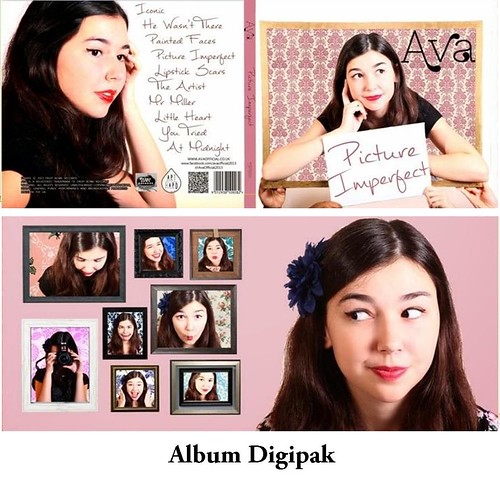
Album Cover

For our album cover we researched the forms and conventions of British, female, indie artists' album covers so that we could create a cover that was typical of these artists; because our music video was already quite unconventional and out-of-the-box (or frame), we decided to balance this out with the conventionality of the album cover so as not to make Ava seem too eccentric.

Website


The above video references some of our main website inspirations, and details the similarities between Gabrielle Aplin and Ingrid Michaelson's websites and our finalised website. In summation, we used most of the website conventions of female indie artists' websites, while also adding some of our own quirky features to set Ava apart from everyone else.

Conclusion

Overall, our products draw upon many of the already established indie-pop conventions, however we also took some issues that we noticed were prevalent in the music industry, and challenged them, in order to create a more accurate representation of the contemporary British music industry.

2) How effective is the combination of your main product and ancillary texts?

The importance of an integrated campaign cannot be ignored, which is why we decided to make our campaign interactive and cross-platform. This type of campaign is crucial when trying to promote a brand, and it is also important to ensure that the message of the brand is consistent for all three texts. For this question, I reference artists such as Cassadee Pope, Gabrielle Aplin, Katy Perry and fictional pop star, Catherine Bennett. We believe that the combination of our texts was effective in targeting our core and secondary audiences, however we noted that our overall campaign contained more links between the website and music video, as opposed to having consistent links between all three products.

Creating A Synergistic Campaign

A mind map showing the similarities between our three texts compared to two other marketing campaigns by Cassadee Pope and Gabrielle Aplin

Effectiveness

The only way for us to really be able to judge the effectiveness of the combination of our products was to look at our audience feedback. After interviewing my mum (part of the secondary audience) and my sister (part of the tertiary audience), I combined their thoughts on our synergistic campaign into a Voki. Additionally, below the Voki is a quote taken from my friend, Meg (part of the core audience), who I also questioned. From the feedback I learned that the combination of our album cover and website was the most effective, whereas there weren't many links between all three texts (apart from the frame).


"I think that the use of the Ava font ties the website and album cover together; it is easily distinguishable as Ava's logo. I also like the repetition of the wallpaper image which a homemade and personal feel to the whole campaign."

Social Media 

We wanted to tie our social media accounts in with our music video by having similar colour schemes and styling. We did this by looking at the social media accounts of similar artists, such as Gabrielle Aplin and Laura Marling. Their twitter feeds include their album covers as an integral part of the page, with Gabrielle Aplin using her English Rain cover as her background and header. Similarly, Laura Marling used her album cover for Once I Was An Eagle as her profile picture and header. 
Gabrielle Aplin's twitter feed
Laura Marling's twitter feed
Ava also adopted this convention, as she set her profile picture as her album cover, in order to promote her album.
Ava's twitter feed
By tying in the album cover with the social media, we subsequently combined the music video with social media. This created a stronger link between all our products, as the twitter feed included a link to the website and music video, and also signposted the album cover.

Colour Scheme

We knew that the colour scheme would be integral to the entire marketing campaign, therefore we decided on pastel colours very early on in the project. This was then developed during the production stage of the project, as we wanted our two main colours for the album cover and music video to be pink and blue; one conventionally feminine colour and one conventionally masculine colour. We wanted to mix these two colours together, as Ava would not stick to the confines of gender roles, and would instead choose to do something a bit different. Below are some colour swatches I made, showing the different range of colours in each product.
The more prominent colour here is pink

The colours of our website are mainly blue and grey - this was quite surprising, as we hadn't consciously decided to have grey in our colour scheme!
The music video ties the website and album cover together, as it has an equal mix of both pink and blue
Similar to She & Him's marketing campaign for "Volume 3", we tried to co-ordinate our colour schemes as much as we could.
She & Him's album cover - mainly blue and pink
She & Him's website colour scheme - mainly yellow, pink and blue - the majority of the website page is the album cover, showing how they tied them in together

Iconography


We decided that Ava's iconography for her debut album would be frames, as she has quite a post-modern outlook on life, and likes mixing up reality and fantasy; this can be seen in our front album cover, as the top of her body is in the frame, but we used Adobe Photoshop CS5.1 to edit the image so that the rest of her body doesn't come out of the frame, to explore Stuart Hall's theory of multiple layers of meaning (perhaps she is only Ava when she is in the frame?)
Using a "colour picker" and "paint brush" tools on Photoshop, I edited the bottom half of Ava's body out of the image
For the frame iconography, we wanted to draw on Goodwin's theory of voyeurism that "there is frequently reference to the notion of looking and particularly voyeuristic treatment of the female body." Rather than seeing the video through the boyfriend's eyes, the perspective/ point-of-view is Ava's. We decided not to encourage the male gaze and therefore tried to subvert the convention of female sexualisation in pop music. This enabled us to show the audience what Ava wanted them to see, as the video is implied to be a construct of her own imagination. To a certain extent, the video could also provide a narcissistic appeal to young girls, who may see parts of themselves mirrored in her actions and/or personality.


Originally, we were going to pay homage to this iconic photo of Grace Kelly, however due to the fact that our frame wasn't big enough for Ava to sit in, we decided to only draw inspiration from this photo

Styling

Some dresses which we thought illustrated
the kind of style we wanted Ava to have
Because we wanted to do something that wasn't really the norm, we decided to style Ava in quite a retro way; with flowery dresses and a peter-pan collared shirt and skirt. This was mainly because the youth of Britain is constantly bombarded by sexualised images of female artists, wearing skimpy clothing and dancing provocatively. We didn't think this to be an accurate representation of most of the female population, as well as it being negative in regards to young girls, who would see these images and think that they would also have to look that way to be accepted and liked. Therefore we styled Ava in a not-too-conservative but also not sexualised way. We wanted her to be seen as happy, carefree and comfortable in her skin. This idea of Ava being a role model was raised after we did a class research task on Catherine Bennett, a character created by a young girl, with the sole purpose to be a positive role model for other young girls. We also consistently had Ava wearing red lipstick with winged eyeliner, as we decided to make those things her "trademarks"

Font & Logo


Choosing a font is always difficult, and we knew that the font we would end up using, would have to be a textual representation of Ava's quirky personality. After visiting dafont.com, we searched for Handwritten or Calligraphic fonts, as we wanted the writing to look like it was Ava's, and therefore create a personal connection between the buyer of the album and our artist. It was difficult to agree on a final font, and we tried out a lot of different styles, but one of the fonts that stuck in our minds was Znikomit No24. We thought that the font was cute and it also had a calligraphic edge to it, which is what we originally wanted. After we showed the font to the audience, they seemed to really like it, and said that it was "easily distinguishable as Ava's logo".

Where we found the font; we didn't like the second version, as we felt that it was a bit too thin and wouldn't stand out to our audience
One of the other things that the audience commented on was the synergistic use of the logo in the website and album cover, but not in the music video. In hindsight, I think that we should have included the Ava logo at the end of the video to further establish artist identity. Instead of just having a black screen at the end, we could have also had "Ava" appear in white writing, as illustrated in the .gif below. This would have created a stronger link between our three products, and I also think that it looks a bit mysterious, as it would instantly cause the viewer to want to look the name up. It's short and punchy, and it's a shame that we didn't include it in the music video.
What the end of the music video should have looked like?

Branding

Ava pulling a funny face,
to show her tertiary
audience that they don't
need to take their clothes
off to have fun/be liked
As mentioned above, the omission of the Ava logo in our music video was a branding mishap, however I think that we more than made up for it using the repetition of other images. For example, (as mentioned above) our use of the frame throughout the campaign ensured consistency and distinguishability, as it immediately created a coherent link between the three texts. We also used lots of shots of the artist herself, as we know how important it is for a debut artist to be recognisable in the industry, and for people to see her the way that she wants to be seen; in Ava's case, we want her to be seen as quirky and optimistic. While some female artists, such as Rihanna and Katy Perry pose very provocatively, we wanted Ava to be seen as cute and funny, through her pulling faces and being quikry and casual.

Rihanna in a photoshoot
Katy Perry in her California Gurls video


Conclusion

In conclusion, I believe that our campaign to market Ava as a debut artist was successful, as there was synergy between all three products, and Ava's branding remained consistent throughout the entire project. I now know that we should have included the Ava logo at the end of the music video to establish a stronger sense of artist identity, but I am nevertheless pleased with the way in which we marketed our debut artist.

3) What have you learned from your audience feedback?

Throughout the whole project we organised audience feedback sessions in order to get opinions from our Core Audience, the 16-24 year old females demographic, on whether or not our ideas were working; a good example of this is when we invited our friend Rhiannon to the media block to see our initial website design. She suggested that instead of introducing the tumblr feed as an external website, we could also integrate the feed straight into the website using a widget. Another example of how we received audience feedback was by organising screening sessions and feedback sessions, which proved to be very useful as we received a lot of constructive comments.

A video we took of some people's reactions to our music video - while some people look a bit indifferent, other look like they're enjoying it!

Generally, the majority of our audience feedback was very positive, with some people going so far as to say that they wouldn't fault anything! However, there was some constructive criticism that we completely agreed with, and due to some of the audience feedback, we even decided to change our secondary and tertiary audiences around, as we felt that we had had a more positive reaction from the 25+ F demographic. Initially, the secondary (25+ F) and tertiary (8-15 F) audiences were going to be the other way round, but we decided to tailor our categories for a better reception and maximum audience compatibility. Demographically speaking, we think Ava would appeal most to female viewers, however our feedback also showed us that we should not exclude the possibility of Ava having male fans too, as we had a very positive reception from them.

Core Audience Feedback - Music Video

We decided that our CA would be 16-24 year old females, as we fit into that demographic and therefore we feel that we can get into their state of mind and find out what would appeal to them. Below is a Prezi showing the workspace of a typical member of our CA, which gave us an insight into the way we could target her directly.

(Please view full screen for maximum immersive experience)
The hobbies and psychographics of our core audience, which helped us to get into their mindset

A video which we shot and edited, showing some of our Core Audience's thoughts about the music video

From the above video, I learnt that we could have spent a bit more time rehearsing our choreography and staging, as it was often considered to be a bit rushed and not as seamless as it could have been. However, it was still really nice to hear that people liked the intentional fakeness of the video, as we had initially intended to explore the theme of fantasy vs reality.

Secondary & Tertiary Audience Feedback - Album Cover & Website

From our secondary and tertiary audience feedback I learned that the two audiences had clashing opinions; while the younger audience liked the repetition of the pink colour on our album cover, the older audience seemed to think it was a bit too much. Alternatively, the younger audience didn't react as warmly to our choice of fonts as the older audience did. This just goes to show that we can't please everyone, but we're very relieved that despite this, both audiences still had so many positives to say about both texts!

General Audience Feedback - Music Video


Above is a Voki, a visual representation of the general feedback we received from all three audiences. This showed us that the majority of our audience picked up on the same things, and it was very humbling to hear that so many people said there was nothing they would change about our video!


SurveyMonkey

For our survey, we decided on a mix of qualitative and quantitative questions, so that we could get a mix of both opinions and statistics. After reviewing our SurveyMonkey results, we found that most people rated the video highly, with us receiving four 10s and eight 8s. The one person who gave us a 5 gave us the criticism that "it just felt too amateur, i just wasn't invested enough", which is understandable, and despite our intention for the video to look handmade and amatuer-ish, we agree that there may have been some points when the viewer could have been bored with the lack of fast cuts and pacing.

Taken directly from our SurveyMonkey music video survey, we asked everyone to rate the video and we averaged an 8!

Potential Male Audience?

Something that we were pleasantly surprised by is the reception we received from the 16-24 Male demographic; most of the boys said that they thought our video was "creative" and "unique", and they all liked the novelty of it. We would therefore consider tailoring our audience, and perhaps try to find a way to target the male demographic; perhaps by adding male merchandise in our website's shop.
Another potential audience - teenage boys?

Conclusion

From the audience feedback I learnt that we had made a good decision in targeting 16-24 year old females as our Core Audience, however I also learnt that we had made the wrong decision in having the 25+ female demographic as our tertiary audience; many of the women we interviewed said that they really enjoyed our video, whereas our secondary audience didn't react as enthusiastically. Therefore, after switching our audience categories round, I now believe that we made the right choice, as we continue to get praise from the 25+ female audience. 

4) How did you use new media technologies in the construction and research, planning and evaluation stages?

New media and especially Web 2.0 played crucial roles in our overall project. They influenced each stage differently, and we tried to use different technologies in each stage, so that they could enable us to work to our maximum potential.

Research


Above is a Prezi detailing the research process and some of the new technologies that we used.

Planning

As I mentioned earlier, Facebook and web 2.0 were very big parts of our group planning sessions. In order to communicate easily, we created a Facebook thread called "Sharilanila" where we would post our thoughts and ideas, so that we could easily document the stages of the project.

The highs and lows of organizing a prop-heavy music video
We also decided to create a Facebook group (also named "Sharilanila") where we could post more practical things; such as costume possibilities, props and material lists.

Making props gets stressful
The use of Facebook as a communicative tool worked well for us as a group, as we all have some sort of access to the website at any given time, whether it be Facebook mobile or online, therefore enabling us to communicate seamlessly with each other.

The above image was created in a program called Celtx, which is very useful when it comes to mapping out set-ups. The image represents a frame during our first chorus; Ava and the backing dancers move close to the camera in order to create a more personal connection between our artist and the audience, and the ex-boyfriend moves off camera, giving the set hands space to move away all the props from the back (bench, tree, clouds etc). Planning out each setup and the timings was very important, specifically for our project, as a one shot would have been impossible to do without meticulous attention to detail.

Production

The camera we used consistently throughout the project was the Canon 5D Mark II, which we used for our main music video shoots, and for the two promo shoot sessions that we held in the media department.


A blueprint of our set, the Seward Studio, showing the placement of the lights in relation to our "stage"
A picture of our lighting settings
From the above image, we angled all of the lights towards the centre of the set, changing the settings so that all the studio rig 1000k RedHead lights would be on the flood light settings. We mainly lit the floor, however we also lit some of the back walls as we noticed that we were getting a rather ghastly shadow in some of our earlier takes. We also used some floor lights on our final shoot, which really helped, as two of the lights had been broken prior to our shoot session, and we therefore had to substitute two 650k RedHead floor lights on either side of the camera. Learning how to do the lights was really interesting, as I hadn't used studio lights before and being able to change lighting settings is something that I know will be useful in future projects.

Social Platforms

Because Ava would have grown up as a technological native, and there has recently been a massive proliferation of social media, we knew that realistically, she would be on a lot of social networking websites. 

Please turn on annotations for information

The above video explains how we used social media in order to create different platforms from which Ava could market herself/communicate with her viewers/fans, as we think that she'd be an artist that is very invested in the fans' opinions and comments.
Taken from a study by GlobalWebIndex, showing how many people use each social network
Because we knew that social platforms are so integrated in our current society, we decided to create a page on each one of these platforms for the following reasons:
A mind map showing some facts about the different social networks we used, and why we used them
We also created a Facebook group for our set hands and extras, so that we could tell them what costumes they had to bring and what time they would have to get to the set. This was very efficient, as all of our helpers turned up on time for all three shoots, and we didn't have any wardrobe malfunctions.

Post-Production

Album Cover

The editing we used on Adobe Photoshop CS5.1 enabled us to use a Skin Smoother tool, which acted as an airbrushing tool, to get rid of wrinkles and some of the softer shadows. It also made the image look softer and with less flaws, as it took away all of the blemishes. As you can see in the .gif below, the layer which carries the mask includes a Gaussian Blur and a High Pass, which when combined, create a slightly blurred and smoother looking surface.


Music Video

Because our video is a one shot, we didn't have very much editing to do. In order to try and make the music video a bit more exciting, we decided to add some effects at the beginning and the end of the video. For the beginning of the video we decided to have a Fade In, as we think it eases the viewer into Ava's world; it is also something that we noticed in some of our references. For example, Kate Nash's Mouthwash has a fade in at the beginning, as does Amy McDonald's Don't Tell Me That It's Over.
dfjdkfj
Kate Nash's OMYGOD! music video also features this convention
sapdsajfhsdjl
Amy McDonald's Don't Tell Me That It's Over music video uses a fade in at the beginning

For the ending of the music video, we decided on an Iris Round effect, as a lot of the music videos we looked at had this transition at some point during them;
dlkfdlkf
dlkfdlkf
Lily Allen includes this effect at the beginning and end of her Alfie music video
Kate Nash also uses this effect at the end of her Pumpkin Soup video
dkfjdkfj
In order to achieve this effect, I added an Iris Round video transition and reversed it, then I also moved the position of the Iris Round effect so that the shot would show only Ava's smiling face at the end. 
The final few frames
For the grading we used a Three Way Colour Corrector on Adobe Premier Pro CS5.5

Website

We also used Wix, a website building program, to create a website, which acted as the hub of the entire campaign, as it features links to the album, music video, Ava's single, her tour, merchandise and links to all the social media we adopted. It also provides institutional context, for fans who may be interested in her label and similar artists that would be signed to her label. The website also acts as a fun place for fans to go and explore Ava's world, and find out more about her music career.

A diagram showing the transition from our flat plan to our actual website

Evaluation

After we exported our final cut from Adobe Premier Pro and then uploaded the export to YouTube, each member of our group posted the link to our music video on their own individual Facebook account, and also included the link to our SurveyMonkey survey, where we'd collect anonymous feedback (because we found that some people were more comfortable giving their criticisms anonymously)


After posting this, I received a lot of lovely comments from my relatives over in Serbia, Bulgaria and Spain, and they even promoted the video on their own accounts! This was excellent in terms of marketing, as they gave us an even wider audience reach by instigating free word-of-mouth marketing.
Some YouTube statistics showing the amount of views geographically
We also put the link to our music video and survey onto twitter, and we each tweeted the video from our own twitter accounts. This ensured that we would target our viewers directly, as only our "followers" would have seen our tweets, and therefore they would have been more likely to click on the links. Some examples of our tweets are below.
I even tweeted Lily Allen the link but unfortunately she hasn't replied yet :(
Emily also tweeted a link to Ava's website and the survey we designed specifically for the website here and I retweeted the tweet, in order for my own followers to view it and hopefully complete the survey

A mindmap detailing the technologies I used when I was writing my evaluation & how I used them

Conclusion

Overall, new media technologies had a very large role to play in our project; while we utilised our technological nativeness with regards to social media, we also tried to utilise as many new technologies as we could; having never used Wix and most of the other technologies I used for my evaluation before, it was an interesting learning curve. I believe that we used the technologies effectively and to the best of our ability.