Music Video (left) Album Cover (right)

ALBUM DIGIPAK OFFICIAL YES
Music Video

Website

entersite
Website
Showing posts with label Emily. Show all posts

Thursday, 19 December 2013

Editing

As we were making a on-shot music video we didn't have to do much effort, with much of our effort going into the pre-production of our music video which had to be meticulous.

However, despite getting a large number of great one shots, in non of them did we quite achieve the level of perfection that we were satisfied with. We narrowed it down to 2 shots however:
  1. The only problem was a strand of Ava's hair kept falling in front of her face which we felt detracted from her aura of calm and control, as well as from her appearance and the audience's ability to fully connect with her as they may have been distracted
  2. During the final set up the shark hit Ava which made her lose character for a second
Luckily, because we found using the tablecloth cut to be ineffective as it was always at different distances from the camera we had decided to cut it out of the choreography. This meant that we could cut out a complete tablecloth take from a previous one shot from the second shoot using Adobe After Effects, so we were able to use it as a transition between the two takes, using the first 2 set ups from take 2 and the 3rd set up from take 1.

Monday, 16 December 2013

Making Merchandise

We made lots of merchandise in order to increase the purchasing opportunities on our website and the audience interactivity, and so that fans can identity themselves with our Artist. This was particularly important as out target audience of 15-24 year olds and our secondary audience of 8-15 year old girls often enjoy buying merchandize, and their parents will often buy merchandize as a gift for their children. We also catered for our target audience's typical interests of baking and fashion.


Development of the Homepage

 
Initially our homepage only displayed the slideshow of events and news items, but we realised that it was not particularly interactive or immersive - which is essential for a website homepage. One thing we therefore decided to add was the Twitter feed, which allows fans to see what Ava is talking about as soon as she says it. This will make the fans feel like they have a stronger relationship with her. We also added a banner for her new single 'He Wasn't there', and a link to her debut album, 'Picture Imperfect'. The countdown to her UK tour was a late addition, but it creates a more exciting atmosphere, and a link is also provided to buy tickets for the tour.
 

Clicking on the 'Buy Tickets Now' button will take the user to the Tour page. Initially this page was named events, but upon conducting further research, we realised that it was more conventional to have a Tour page rather than an events page, especially as many of the 'events' can come under the news section.

Tuesday, 10 December 2013

Possible Album Names

  • In The Afternoon
  • Postcards and Petticoats
  • Petticoats and Polaroids
  • Take 1
  • Ava in the middle
  • Comic Sans
  • Stepping Out
  • Clean Slate
  • Pictue Imperfect
  • You've Been Framed

Website To-Do List

- We need to make the homepage more aesthetically pleasing - one idea could be to put up stills of Ava with separate bits of information, such as tour dates, album releases and brand endorsements.
- Our news page, at the moment, is fairly text heavy and since a website is supposed to be a visual form of marketing, it is essential that we cut this down.
- Our music page needs work as we must add a track list from Ava's debut album, alongside a Soundcloud clip of He Wasn't There
- Our photo galleries must be changed so that the galleries for the album shoot and for the music video shoot appear on different pages.
- Although we have a few products on the shop, it would be great to personalise a few more and make them available on the online shop.
- The link to Ava's Tumblr account/ visual blog does not seem to be working so we must find a solution to that.

Album Art Development

Album Cover
We finally decided on the photo we want to use for our album cover, and with this photo, we can still incorporate our original frame idea into the digipack. When editing the original photo we decided to remove Ava's body from outside the frame to make it look like she is only in the frame. We also added the pink wallpaper background in the frame to give it more of a girly feel. Initially we considered removing the hands, but we then thought that the stage hands idea is very prevalent in our music video, and so featuring them on the album cover would provide synergy between them. 
 

When trying to scale this image on the digipack template, we had to resolve some issues. One issue was that we were trying to fit a rectangle frame in a square template. This took a while to resolve, but we ended up cutting out parts of the frame and moving them inwards so that they would not be cut off when printed.


Left Inside Panel
For the inside left panel, we continued to use the wallpaper and frame idea that is on the front cover. The wallpapers in the frames have a pastel colour scheme.
 

We decided to change the background of the wall to fit in with the colour scheme of the front cover, and we edited some of the wallpapers in the frames as we felt the green and purple was too great a departure from our established colour scheme.
 
Right Inside Panel
We considered using a picture of a record player behind the CD, especially as it fit in with her retro modern feel.


 We then decided to create more synergy between the two different inside panels, first by trying out some of the pictures we took with the frames:

Then by trying a picture with the same colour background.

Back Cover
We used a simple but iconic picture of Ava for our back cover, putting our track listing in line with the contours of her profile.


Grading

Anna used this video as it taught her how to create a mask using Secondary Color Corrector, allowing Anna to change Ava's orangey skin tone by creating a colour mask. Anna did this by changing the settings of the video to composite then using the pen tool to piock the colours she wanted to change.
http://tv.adobe.com/watch/short-and-suite/basic-secondary-color-correctiongrading-in-premiere-pro-cs55/


Anna tried several test grades to make Ava's skin tone match what it's like on the Album and the website.

We then used the colour finesse tool in Adobe After Effects to achieve a better overall tone, then once again the Secondary colour tool to edit the pinks which had looked quite dull.

Wednesday, 4 December 2013

Brainstorming Song Names

Here is a list of song names we brainstormed for Ava's debut album:
  • Wild Youth
  • Porcelain
  • Jitter-Bug
  • Bag of Tricks
  • He Wasn't There
  • James Dean
  • Apple Crumble
  • Turn Right
  • At Midnight
  • Trepidation
  • Bournemouth Blues
  • Leeds Lies
  • Southend Salutations
  • Warwick Ways
  • Dundee Dancing
  • Seaside Romancing
  • You Tried
  • Broken Bones
  • Tiny Toes
  • Grimsby Goodbye
  • Hugs from Hull
  • Dreaming in Ink
  • Lifted
  • Jukebox
  • Tequila Mockingbird
  • Head in the Clouds
  • In the moonlight
  • Getting Over You
  • Brainflower
  • Polka Dot Pinstripes
  • Iconic
  • I don't have to love you
  • Lipstick Scars
  • Shipwreck
  • Little Heart
  • Tick Tock
  • The Author
  • Silver Lining

Tuesday, 3 December 2013

Developing Images

Following on from the them of frames in our music video and our album cover, we decided to develop imagery using frames, connoting her picturesque quality, her hidden side and that people try to silence/still her but she can't be tamed.

This is a possible design for the back of our digipack.
 
This could be a possible banner on our website:

 
This might work for a background of the website if we don't use our album cover:
 
I also tried a Romeo and Juliet style image to show that she doesn't need a man  and her independence.
 
We also experimented with a pop art look.


I put many of the photos from our first shoot in frames:


I tried out putting our Grace Kelly posed pictures in a different frame to see whether the thumb poking out would work.


Emily also experimented with black and white effects to achieve a retro starlet look:


I also experimented with other black and white effects, testing out pop art effects as well.


Monday, 2 December 2013

Back Up Shoot - 30/11/13

We had our final shoot last Saturday, which we felt was necessary to secure the perfect one shot. Overall, the shoot went really smoothly, and we are really happy with the many takes that we managed to shoot throughout the day.
 
As the studio was free the day before, we made sure we sorted the lighting out prior to the shoot day, as well as any props that needed to be finalised. This saved time on Saturday morning to communicate with our stagehands and solve any last minute difficulties.
 
Another thing we made sure we did prior to the shoot was to mark up the position of the props, so that each take could be as close to perfect as possible, with the props aligned as they needed to be. This not only helped the stagehands with their job, but also made the process of resetting the set a lot quicker and easier.
 
As this was our last shoot, we wanted to do complete one-shots throughout the day rather than rehearse beforehand. Therefore, we called in stagehands who had been to one or both of the previous shoots, so that they knew roughly what their individual roles were.
 
We also had to make sure we kept everybody's morale up, as with the lights and consistent movement of stagehands, the studio did get quite warm and the crew did get a little tired towards the end of the shoot. We tried our best to keep everybody happy by encouraging them to have fun, and also providing them with food and water.


Reviewing Our Back Up Shoot Footage

Take 1:

What went wrong:
  • Frame at beginning
  • Mila's head cut off in Chorus
  • Stevie holds window the wrong way
  • Quickchange
  • Serenaders
  • Trustfall
  • Boat to the side
  • Everyone falls slightly with frame
What's good about it:

Take 2:

What went wrong:

  • Flower Petal weird
  • can see pizza in box
  • Window wrong way
  • serenaders wrong
  • Trustfall
  • right/wrong sign hard to read
  • Shark takes centre stage
  • Shark late on 'little girl'
  • Boat to side
  • Mila puts hands on face

What's good about it:
  • Frame better
  • throwing good
  • End Dance

Friday, 29 November 2013

Pre-shoot to do list - 30/11/13

As tomorrow is our final shoot, we want to make sure everything is going to be done to near perfection. So we made a to-do list to assign tasks to everybody in the group to do between 7.30am and 9am, so that we are ready to go once the shoot starts at 9am.

Already done
- The lighting has been done roughly, and the studio has been set up with the white backdrop and white paper.
- We have sorted the props into three set ups
- We have contacted our stage hands for tomorrow and informed them of timings.

To do tomorrow morning
- Get Mila's hair and make-up ready as soon as possible
- Perfect the lighting
- Sort out the set so that the creases in the backdrop do not appear
- Mark where the props need to go in relation to the camera
- Make the flowers/ grass more stable
- ALSO mark the camera in case it is accidentally moved during the shoot
- If food needs to be bought to cater for the stagehands, make sure it is done quickly and before people start to arrive
- Assign very specific roles to each of the stagehands

Website and Album Art Photography

We are planning to use some similar shots on our website and our album cover, especially as from our research we found that similar artists often used their album cover as the background of their website.

Photo Shoot 1: 26/11/2013

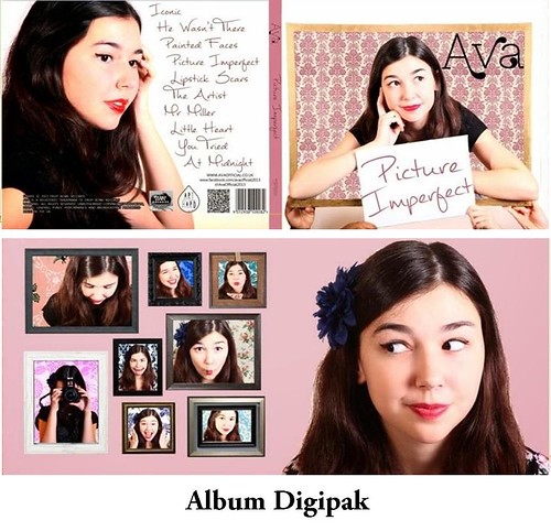
We tried to recreate the iconic picture of grace Kelly sitting in a frame but our frame wasn't big enough.


We also experimented with other frame shots.


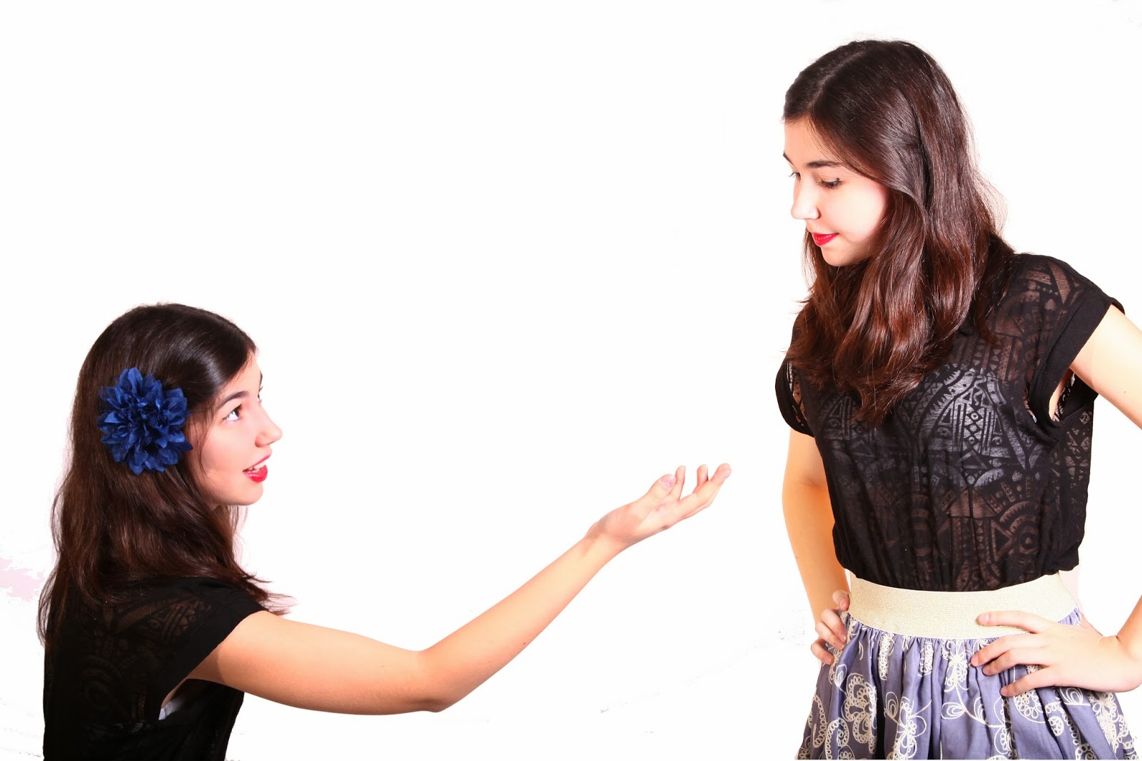
We tried two different outfits but unfortunately the shoes didn't match the second one.

We took pictures with one of the signs from our shoot but we will change the writing on it later, as well as several of the other props from our music video.


Photo Shoot 2: 29/11/2013

We used different outfits once again to make sure that their would be a variety on the album cover which matched with our research.

We took more shots with the frame.


We took several different facial expression shots in case we wanted to put them in different frames and connote her vibrancy and outgoingness.


We also took shots were a teddy bear was used a replacement boyfriend to show her various emotions.


We tried out using several hipster props such as a camera and glasses that would appeal to our target audience.


We experimented with a mirror which didn't really work.

We also shot the other side of our initial idea for the inside cover which gives the view from the other side of the frame.

Finally, we tried a few LSs and MCUs using a stool which we felt helped connote the fifties feel of our artist.