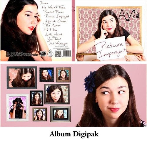
I think that we effectively created a brand for Ava through the strategic combination of the music video, album cover and website, by using brand establishment techniques such as iconography, a clear and memorable logo, a consistent sense of style across the artefacts and similarly styled photographs.
What we wanted to do with our marketing campaign was to intelligently use the 50s as a stylistic base across all the texts, which I feel we did successfully. Furthermore, we wanted to convey a sense of conventional femininity, as we have done with the prevalence of the colour pink across our campaign. However, we wanted our target audiences to be able to associate traditional femininity with female empowerment rather than weakness.
Synergy
It is particularly important for an up-and-coming artist such as Ava to create a marketing campaign that is synergistic, as in the music industry, tough competition from both established and aspiring artists means that one has to try exceptionally hard to set themselves apart from the crowd. Therefore, a highly stylised and synergistic marketing campaign helps to solidify brand identity, making it memorable for members of the target audience and thus spurring potential sales.
It is particularly important for an up-and-coming artist such as Ava to create a marketing campaign that is synergistic, as in the music industry, tough competition from both established and aspiring artists means that one has to try exceptionally hard to set themselves apart from the crowd. Therefore, a highly stylised and synergistic marketing campaign helps to solidify brand identity, making it memorable for members of the target audience and thus spurring potential sales.
I analysed previous marketing campaigns of female artists in the indie pop genre, namely the In Your Hands campaign (Eliza Doolittle), the Hard Out Here campaign (Lily Allen) and the What We Saw From The Cheap Seats campaign (Regina Spektor). This is what I concluded:
- Campaigns tend to use the same, or similar imagery as is used in other artefacts - this is particularly true for the album art and website. However, the images serve different purposes in the artefacts; on the album art, the image is used to make a visual impact on the consumer, whilst on the website, the same image would be surrounded by social media links/ purchasing opportunities to heighten user experience.
- The logo and the font used should be consistent throughout all the texts.
- The colour scheme should be instantly recognisable and consistent throughout the campaign to create a sense of memorability for audience members
- The props and costumes that appear in the music video could also be featured on the album art/ website as iconography that becomes instantly recognisable.
How we incorporated synergy into our campaign
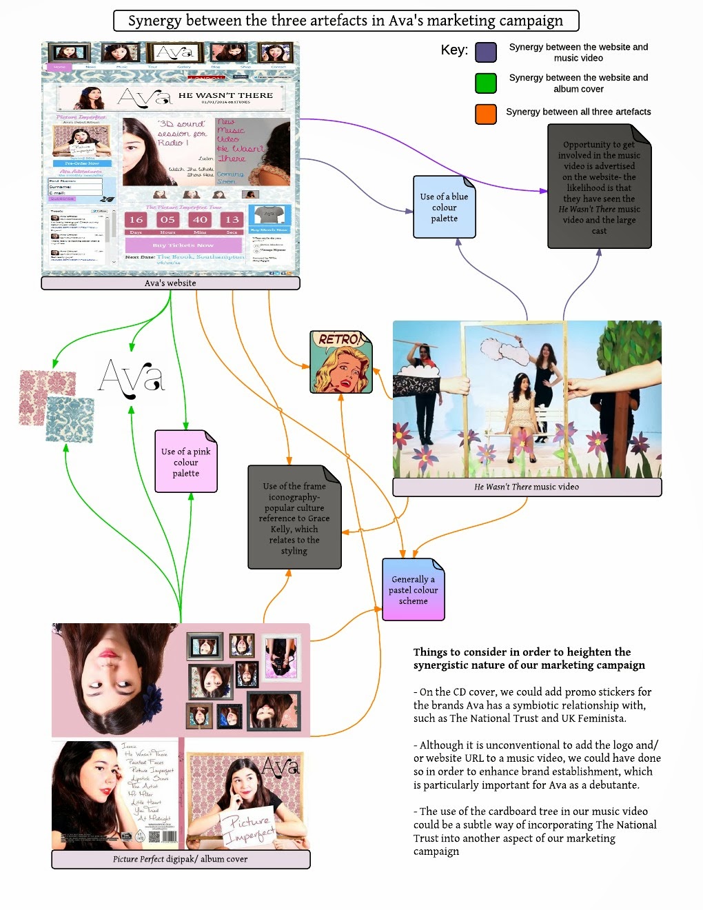
Below is a flowchart/ mindmap demonstrating the ways we created an effective combination between our texts, both visually and through the information we provided.
- I found particularly that it was easier to establish synergy between the album cover and the website, because their respective design spheres share similar purposes. This is further demonstrated by the above gifs, where we see that the combination of Regina Spektor's album and website look a lot more synergistic.
- However, I also found that it is easy to use the interactivity of the website to one's advantage, and thus create a sense of synergy with the music video.
Artists in the music industry are increasingly using social media to interact with fans and provide exclusive content. Therefore, we thought it would be advantageous to incorporate social media platforms both into our website and our album cover.
- Firstly we used the same photo of Ava across all the social media platforms to create memorability and thus synergy between them
- Firstly we used the same photo of Ava across all the social media platforms to create memorability and thus synergy between them
- We also inserted links to other social media platforms on each network, but not every network had links to every other network, and in hindsight, I would've included a social media bar on all of her online marketing materials
The website is strongly associated with creating a hub and allowing an audience to interact with the artist, and in the contemporary music industry, artists use a range of social media platforms, all of which serve different purposes, in order to market themselves. We also did the same for Ava, and below is an annotated video about each of our social networks and their individual purposes within the context of the campaign.
Style and brand identity
Synergy can be established visually as well as through providing the same information in the same manner on multiple platforms. In terms of visuals, as can be seen on our moodboard, we were heavily influenced by the retro/ 50s style, and thus incorporated this into our marketing campaign as a unique selling point.
Logo
Logo
Below is a diagram of how we researched and created Ava's main logo, which we then used on the album cover, website, social media and on merchandise.
We had previously discussed changing the colour of the logo to brown for our album cover because it worked well with our pink and gold colour scheme. However, as Ava is a new artist entering the music industry, we did not think it would be appropriate to make alterations to her logo and thus establish a better brand. It would be something to consider after the Ava brand had been established, however.
Colour scheme
We wanted to brand Ava as being quite conventionally feminine, and therefore settled on a pastel colour scheme which used pink as a primary colour. However, although the general colour scheme across the three texts is quite similar, with a mixture of pinks and blues, we can see that in the album art in particular, the pink is a lot more prominent than the blue, something which I would reconsider if I were to go redesign the album art.
Iconography
Artists usually have a piece of iconography that underpins their marketing and represents the unique selling point of their brand; usually with female artists of the indie-pop genre, this is something about their appearance. For example, Florence Welch (Florence & The Machine) has her striking red hair and Kate Nash's recently reconstructed brand image involves a heavy reliance on red lipstick.
For Ava's iconography, we decided not to use her physical traits and rather to use a symbolic prop. We decided to use a frame as our piece of iconography for a number of reasons. We analysed the significance of the frame in a semiotic sense, and below is an audio summary of what the frame represents in terms of branding and Ava's ideology as an artist:
The frame is first and foremost a popular culture reference to this iconic, retro photograph of Grace Kelly, the message of which we have manipulated to appeal to Ava's target audience and support her ideologies.
The frame at the beginning and at the end of the music video is symbolic of a cyclical romance
The album cover and the inside cover both present Ava in various frames, which again links to the idea that there is not one set, concrete way in which people should perceive one another.
The website header also features the same frames as those on the inside cover of the album, and this is a prime example of the way in which the use of the frame iconography works in a synergistic fashion across our media products
In conclusion, I feel that we produced a great marketing campaign for Ava through the effective combination of all of our media texts, although we could perhaps have paid more attention to colour schemes and Ava's physicality as means of establishing a brand.


No comments:
Post a Comment