Music Video (left) Album Cover (right)

ALBUM DIGIPAK OFFICIAL YES
Music Video

Website

entersite
Website

Friday, 10 January 2014

3. What Have You Learned from your Audience Feedback?


We learnt that audiences of all ages found our music video entertaining and immersive, and although the colour schemes, narrative and mise-en-scene mainly appealed to women, men still enjoyed watching the video. It was particularly important for us to appeal to many different audiences but especially our target audience of 15-24 year old females so we could establish a solid base of support through our products for our unknown artist.

When planning our music video we decided on our primary, secondary and tertiary audiences

Most people find one-shot's entertaining and enjoyable but we thought that our products would appeal to women in general more:

However by challenging representations of women on the music industry we also hope to appeal to women:

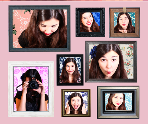
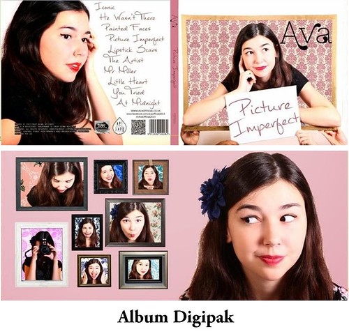
  • Ava's funny faces/derps on the album cover and website - doesn't have to be perfect, women can be funny too
  • While the song is about a relationship the video satirises it, breaking conventions by resolving the narrative without the artist being in a relationship
  • Ava combines traditional aspects of femininity with untraditional female qualities such as strength and being active instead of passive within her relationship
  • Ava is not pining for a relationship and isn't defined by one
When we gathered our feedback however, we were pleasantly surprised at how positively men received it as well.

Uses and Gratifications Theory:
In Lianna Le Havas' Music Video for 'Forget', a video with a similar narrative to ours of a girl unhappy with her boyfriend, made by a similar female British indie artist.


Entertainment
-Liana le havas is an enigmatic performer
-Humour from bad things happening to boyfriend eg bucket of water being on him
-Attractive artist
-Aesthetically pleasing with consistent colour scheme
-May provide emotional release
Information
-Seeing relationship breaking down
-Possible inspiration for own life decisions
Personal Identity
-Identifying with situation
-Artist as a role model in terms of clothing, coolness and prettiness
-Values of deserving a good relationship

Relationships
-Gain insight into artist’s feelings in relationships
-See her relationship with friends contrasted with her relationship with man
-Perhaps a talking point especially amongst Artist’s fans
-Artist show to be strong powerful and in control as well as attractive – may provide substitute for real-life companionship
-Identifying with her plight

Our use of Blumler and Katz's Uses and Gratifications Theory:
Part of the way we tried to appeal to our audience was through the different areas identified in Blumler and Katz's theory, as by meeting their wants and needs with our media products we hoped that they would not only purchase Ava's album and music video, but also be encouraged to become fans of our debut artist.
 
Entertainment and Information:


Personal Identity: (examtime - if some information is cut off please scroll out)
by latymermedia2012

Personal Relationships: (examtime - scroll to see more)

by latymermedia2012

We held a screening of our completed music video which we invited our actors and friends to come along to, publicizing it using word of mouth, social media and a teaser trailer to try to encourage as many people to come as possible:


Audience Feedback

We gave out questionnaires at the screening, having a voxpop and to other friends and family, as well as posting it online using SurveyMonkey.

We asked members of our target audience what they thought about our music video and received quite positive feedback:


Our feedback suggested that we had managed to make a video that  is professional-looking along with fitting into a genre and image, as many were reminded of other music videos, many of which were our influences:
However the fact that many said 'no' perhaps suggests that we weren't conventional enough, although everyone replied to our questionnaire/surveys saying that they liked the video:


I found it particularly interesting to learn how our target audience bought music as many still purchased hard copies of music despite the move of many music selling institutions online, with the vinyl being especially surprising but also indicating that our retro theme fits well with the current generation of 15-24 year olds:
This suggests we were right to promote the buying of our album online and our artist's large online presence might help promote online sales, but we could have included links to iTunes or other online sites.
 
YouTube Statistics:
This is particularly significant as I was surprised to learn that our music video was viewed most often on smartphones and other mobile devices.

That perhaps suggests we should have focused more on the mobile view of the website, although I did edit all the content on the phone pages to make them readable, though some of the content was not transferable.


We also were able to learn were the majority of our audience originated from:


Dislikes:


Most of the negative feedback we received we had anticipated and noticed ourselves:


  • Whilst we had used the entirety of our schools' studio lighting rack this excluded some lights which where waiting to have bulbs replaced. This was particularly problematic as we were trying to achieve a high key wash as part of our cheery feel, in a similar way to Lily Allen's music video for 'Alfie'
  • We had decided to challenge the typical romantic stories of most music videos and felt like our song could be read in a number of ways. The sugary sweet vocals and the hyperbolic lyrics suggest satire, in addition to the fact that Lily Allen (whose song we're using) is often sarcastic. This disjuncture may arise from the fact the 'He' was originally Allen's father rather than a lover, though I have learnt that making a music video's ideology very clear is important
  • We had more male helpers behind the camera, however they did not conform to the dresscode of the rest of our helpers so could not perform in the video
  • I made the windows for the cafe set up after our first shoot as I felt it was too bare, and perhaps we could have had more in the background of the boat set up
  • Both the globe and the sign were cut off in that particular shot, however 'Ava's performance was best in the shots we used
  • The type of paint we had was not traditional wood colour so this may have affected how realistic it was
  • I think the changes are quite smooth, though the quickchanges and Ava moving backwards into the set ups could have been better and more controlled, though learning that others do not perhaps suggest that we should have asked our helpers to appear relaxed and as though they were having fun whilst they were moving the sets
  • We tried to keep spirits up on the day and keep our helpers energized but the takes we used were from quite late in the day when people might have been tired
Most people however, answered 'nothing' as to what they disliked, and when people said what they liked it was always different aspects. Perhaps then our qualitative feedback just elaborated on what our quantitive feedback indicates, as everyone said they liked our video and gave it a high rating:


Album Feedback:
 
Key:
What people liked
What people didn't like

Website Feedback:
All of the people we asked said our site was visually attractive, although one said it was perhaps a 'bit much', perhaps suggesting that our website is too dense for some people's sensibilities. They also all said that it was easily navigatable ('even for older people') as well as interactive and immersive.

(Scroll to see more)


4. How Did you Use Technologies in the Construction and Research, Planning, and Evaluation stages?

We used a variety technologies extensively in both the research and planning of our texts and their construction, using both new and more traditional media. This enabled us to try out different ways of presenting and communicating as well as reaching our target audience.

Research and Planning:

Web 2.0 was very useful for research, especially as contemporary artists often have a large web presence, with the whole of their often extensive marketing programmes leading back to their website as a hub, with music videos hopefully inspiring people to visit an artist's website.

We had to research for our track and then for the Artist identity we would create around it, so we used the internet extensively.


As well as having regular group meetings, we had a facebook group for the four of us where we could share all that we were doing individually, whether it was research, gathering props and costumes or asking people to help us out:

 We used Microsoft Word to create a Shoot Schedule for the day and to create contracts for our helpers to sign. We also used social media to keep in contact with and update our actors by creating a facebook group where we could post news and reminders and they could reply with any issues or queries they had:
We used google images to create moodboards for our ideas about both set design and Ava's artist identity which served as useful reference points when discussing ideas and planning:

 We not only researched similar artists and texts, but ways in which we could make our sets and pull off our costume changes. Most of  our planning was done on paper such as drawing up timecoded floorplans, but we did have to research and buy some of our props from eBay.

We also used Microsoft Office Word to create our Shoot Schedule and Call Sheet.

We filmed our pre-production progress, using cameras to record developments in our choreography and help us remember any progress we'd made:


We also carried out a lighting test using the lighting rig in our school's studio, which meant we had chosen our preset light settings so we could easily set up on the day.

Our lighting settings
Plan of the lighting rig
Construction:
Music Video Production:
The Camera we used was a Canon 5D Mark II because:
  1. It produces very high quality output - 1920x1080p in 16:9 aspect ratio so it had HD video capability
  2. Shoots 30 frames per second
  3. We could alter the white balance and other variables easily through the menu settings


This camera had to be focused manually however, which led to a technical malfunction at the start of the music video. The video starts with a shallow focus on the frame, but when the frame is removed the focus is not adjusted quickly enough.

This is how we adjusted the focus of the camera:


Lighting
We used the ceiling rig lights to create a bright wash, as well as blue gels to create a blue background on the cyclorama in our school's studio.

We used background lights and 2 two key lights which spotted the middle section where Ava was performing to ensure she was brightly lit, meaning there were no shadows on her whilst she was performing.

We had to introduce 2 ARRI 650k redheads for our final shoot in order that Ava's close ups be adequately lit. This caused some problems as there was a section between the LS and the MCU where Ava isn't in light as much. I rectified this in Post-production using the Procamp tool.
We had a Sound System in the studio so we could play the music out loudly enough for 'Ava' to be able to lip synch along with it even when sets were being moved.
We used phones and social media to keep in contact with our cast, which was very useful as we had an early start (9'oclock on a Saturday morning for our cast) which meant we could remind them to wake up or check where they were.
Music Video Post-Production:
We edited our video using Adobe Premiere Pro CS.5, but we did not have to do much actual editing on Premiere Pro, using it watch our rushes, choose the best one-shot (or in actual fact more than one) and sync  with the music track.

 We did use it however to create the Iris round at the end of the video which is one of the options from the drop down menu of Video Transitions. We dragged it onto the clip, reversed it and adjusted its size and timing to fit with the time that the frame is held up and the end of the video. Several other British Artists have used a similar effect to this (see Kate Nash - Pumpkin Soup below) and we felt it added to the retro feel of the video as well as ending the video with the audience's attention firmly fixed on Ava.


Grading:
As we didn't have much editing to do, grading was of particular importance to us.

To rectify this, we used ProCamp and Three-Way Colour Corrector on Adobe Premiere Pro as well as Colour Finesse on Adobe AfterEffects.

Bringing out the pinks and blues was particularly important as we were trying to establish Ava's unique and identifiable colour scheme, so I used the Secondary Colour Corrector to bring out the pink tones, particularly as I wanted Ava's lips and cheeks to achieve the same brightness that we had reached in our promotional photography.

This is how I graded the video:


We also used Colour Finesse on Adobe AfterEffects to improve the overall look of the video, helping brighten and bring out the blues, using colour wheels and primary and secondary grades.

We used Adobe AfterEffects for the cut between the second chorus and the third verse, using rotascoping to cut around a tablecloth we had used as a cutting point in our test shoot. We felt that while we could have used either of the two complete takes we had, but we would get the best of each one by combing the two, with the tablecloth adding pace and quirkiness to our video.
 to 
  1. The first take was excellent until during the final set up the shark hit Ava which made her lose character for a second
  2. The problem in the second take was a strand of Ava's hair kept falling in front of her face' which we felt detracted from her aura of calm and control, as well as from her appearance and might have distracted the audience from fully connecting with her
Album Production:

Once again we used the Canon 5D Mark II to take our shots, using a white background so that we could easily edit it out or around it. This proved very useful when it came to editing our images in Adobe Photoshop, except when editing the pictures in which Ava is wearing a white dress (as pictured below) as tools such as Magic Wand would often confuse the dress with the background.
 

Originally we had planned to reference Grace Kelly in our album cover, but the photos we took in that style didn't work out as well as we'd hoped, especially as the frame we had was a very different size from the one used in the photograph of Gene Kelly.


Luckily we had taken other shots which we were able to use instead, but they still required editing to fit the square format of the album cover.
We used:
  • Spot Correction Tool and Clone Tool to smooth out her skin tone and get rid of any awry hairs
  • Magic Wand, Quick Selection Tool and Rubber Tool to erase the background and Ava's skirt
  • White pen tool to erase bits of cardboard sign on show and the original text
  • Text tool to add the Album title and Artist name
  • Brightness and contrast to make her look more dramatic and eye-catching
Inside:
We erased the backgrounds from several pictures in which Ava was doing a variety of facial expressions, and to all apart from one we added a frame and wallpaper, all of which we merged to form single layers for each framed photograph. We arranged them in a  picture of frames that I had originally made for the website before we decided that it was better suited to the album. That meant we had to use the Quick selection tool to rearrange the frames into a square format:

 to

The Back Cover:
We had already researched fonts and song titles by the time that we came to making the back cover we knew what font we wanted for the tracklist, especially as we had used the same font for the album title.

We used a candid picture that was a little over-exposed, so we edited it too make her skin look more realistic, though her skin tone was criticized in the audience feedback as looking too different from the other photos of her.


Website Production:


We found that the most successful websites were the ones that had the greatest interactivity and number of purchasing opportunities. Wix was particularly good for this and for first time web-designers. It was the main software I had never used before, but luckily Wix is designed to easy to use, and we were able to make full use of different wix apps:

  1. Slideshow function
  2. Poll
  3. Buttons
  4. Shopping cart
  5. Countdown
  6. Mailchimp - email subscription service allowing an artist to connect with fans and remind them of purchasing opportunities
  7. Music Player - Embedding track into a play button
  8. Embedding social media feeds and blogs
  9. Picture grid
  10. Text boxes and Separating Lines that compartmentalized the pages, making them easier to read


Once again we used Adobe Photoshop CS5 to create graphics and edit pictures for the site.


Evaluation:


We uploaded our finished video to YouTube and spread the word via social media, telling our friends to pass it along and so forth.
Whilst we shared the link to our video we also encouraged people to take a questionnaire afterwards. We used SurveyMonkey as it is easy to create and user friendly for survey respondents, as well as enabling us to pose as many questions as we wished and allowing us to analyse the result afterwards. We sent emails to friends and family as well as spreading the word on our various social media accounts. 

Survey Monkey was particularly useful as:

  • It allowed anonymous responses
  • It allowed us to pose both quantitative and qualitative questions
  • There was no limit on the number of questions
  • We could look at all of an individual's responses allowing us to analyse what genres people who liked out video were fans of and similar demographic statistics
  • As an online survey tool we could share it with many more people than we could manually, especially as people could fill it out at their own convenience
  • We could use respondees IP addresses to find out where people had responded from by using http://whatismyipaddress.com/, unsurprisingly finding that most were from the UK and especially London
We didn't just gather audience feedback online however, using cameras to film our audience responses. Once again we had to use Adobe Premiere Pro to edit these, along with the screen captures we made using Camtasia.

When presenting my evaluation I used a variety of tools:
I found Photosnack particularly useful as it allowed my to make slideshows of images in a aesthitically pleasing and simple way, allowing me to control the slideshow's time and presentation, and being readable without being in fullscreen mode, whilst other tools like Padlet were highly interactive and easily adjustable.